Ayumi Hamasaki Icons |
Resource Center Links
This Month's Contests | Hosts Looking for Hostees | Hostees looking for Hosts | BigBookofResources
Submission Guidelines
  |

 Mar 11 2008, 09:58 PM Mar 11 2008, 09:58 PM
Post
#1
|
|
 Senior Member  Group: Member Posts: 786 Joined: Dec 2006 Member No: 488,341 |
Finally opened up Photoshop again, it's been about a month.
This was for a contest on a forum. Comment/critique to your hearts content. 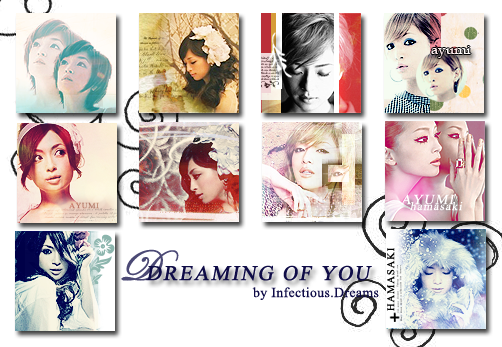 |
|
|
|


|
Mar 11 2008, 10:37 PM
Post
#2
|
|
 YUNJAESU<3 Group: Official Member Posts: 1,291 Joined: Oct 2007 Member No: 585,275 |
They're not bad, although some of them seem like they have a smart blur on them which makes them a bit of an eyesore. My favorite would have to be third in the second row from the left. :). I love the colors and the pose, although I would get rid of the cut out of her eye. It's useless and doesn't give any positive effects. Then it would be the first one on the third row (next to the "Dreaming") The colors and the brush is great. :). Second row fourth from the left could do without the "AYUMI hamasaki." It just looks a bit weird with it. Maybe it's just the font, but it's just not nice looking at all (to me, at least). The fourth from the first row could do without the text as well. Overall set, it's not bad and you did a pretty great job. :).
|
|
|
|

|
Mar 12 2008, 11:18 AM
Post
#3
|
|
 Senior Member Group: Head Staff Posts: 18,173 Joined: Mar 2005 Member No: 108,478 |
These are pretty nice! I really like 2, 9, and 9. Nice images and coloring.

|
|
|
|
|
Mar 12 2008, 03:10 PM
Post
#4
|
|
 i ish a duckie. :D Group: Member Posts: 36 Joined: Sep 2006 Member No: 468,130 |
Wow! these are really awesome! The last 5 are my favorites, especially 9 & 10. I love the color, in all of them.
|
|
|
|


|
Mar 12 2008, 04:34 PM
Post
#5
|
|
 crushed. Group: Staff Alumni Posts: 9,432 Joined: Jun 2004 Member No: 20,026 |
i really like them all, especially the first ones in the second and third rows. the only thing i would suggest is to add borders to them, unless you have white/transparent ones already because i always think that adding borders makes icons stand out a little more :)
|
|
|
|

|
Mar 12 2008, 09:16 PM
Post
#6
|
|
|
Senior Member Group: Member Posts: 786 Joined: Dec 2006 Member No: 488,341 |
Actually, I didn't use blur on any of them >.>
|
|
|
|
|
Mar 13 2008, 06:30 PM
Post
#7
|
|
|
i ish a duckie. :D Group: Member Posts: 36 Joined: Sep 2006 Member No: 468,130 |
Where did you get your pictures?
|
|
|
|
|
Mar 13 2008, 06:59 PM
Post
#8
|
|
|
Senior Member Group: Member Posts: 786 Joined: Dec 2006 Member No: 488,341 |
|
|
|
|
|
Mar 13 2008, 07:26 PM
Post
#9
|
|
|
GD. <3 Group: Staff Alumni Posts: 1,222 Joined: Aug 2005 Member No: 198,566 |
They're all solid icons, and I like all of them except the first and last in the first row, and the third in the second row cuz of the eye cutout.
Great job. |
|
|
|

|
Mar 13 2008, 11:58 PM
Post
#10
|
|
|
i ish a duckie. :D Group: Member Posts: 36 Joined: Sep 2006 Member No: 468,130 |
QUOTE(ForgiveTheSinner @ Mar 13 2008, 06:59 PM)  Thank you :D |
|
|
|
|
Mar 15 2008, 02:07 PM
Post
#11
|
|
 badassified Group: Member Posts: 36 Joined: Feb 2008 Member No: 621,426 |
You made new icons?! Why wasn't I told of this?! Darn you, Ariel! I think your icons really have improved- they're all so beautiful and I don't even like Ayumi Hamasaki. I'm going to put them in my stash bag!
|
|
|
|

|
1 User(s) are reading this topic (1 Guests and 0 Anonymous Users)
0 Members: