gonna get you high? |
Resource Center Links
This Month's Contests | Hosts Looking for Hostees | Hostees looking for Hosts | BigBookofResources
Submission Guidelines
  |

 Aug 22 2007, 08:35 PM Aug 22 2007, 08:35 PM
Post
#1
|
|
 devan.urie  Group: Member Posts: 246 Joined: Dec 2005 Member No: 314,247 |
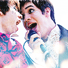
okay so this is my fourth theme for my website. i think its one of my favorites so far. please let me know what you think of it. honesty is the best policy. lmao
detuend v4: gonna get you high and if you are curious you can go HERE to see past themes. |
|
|
|


|
Aug 22 2007, 10:07 PM
Post
#2
|
|
 does the D.A.N.C.E. Group: Member Posts: 53 Joined: Apr 2005 Member No: 120,903 |
I don't really like the fonts, and I think Mr. Saporta could have been less saturated, but it might I just be the colors on my iBook. Otherwise I quite like it; the CSS is nice :)
|
|
|
|

|
Aug 22 2007, 10:30 PM
Post
#3
|
|
|
devan.urie Group: Member Posts: 246 Joined: Dec 2005 Member No: 314,247 |
thanks[:
i saturated him like that on purpose. i wasnt what sure to do with his pictures, and i didnt want to just leave them how they were. and which fonts do you not like? |
|
|
|
|
Aug 23 2007, 07:04 PM
Post
#4
|
|
|
does the D.A.N.C.E. Group: Member Posts: 53 Joined: Apr 2005 Member No: 120,903 |
QUOTE(breakkdancee @ Aug 22 2007, 11:30 PM)  thanks[: i saturated him like that on purpose. i wasnt what sure to do with his pictures, and i didnt want to just leave them how they were. and which fonts do you not like? the handwriting-esque "g-a-b-e gonna get you high" just doesn't flow to me, for some reason. I think it's the bright whiteness of it. I get that the handwriting brush in the background was used, and the "DETUNED" looks handwritten-y, too, so it's not like it doesn't match... it just doesn't flow. which doesn't make sense really. bah I'm just picky. it looks good :D |
|
|
|
|
1 User(s) are reading this topic (1 Guests and 0 Anonymous Users)
0 Members: