ideas on how to incorperate this into a web layout |
  |

 Feb 3 2007, 01:59 AM Feb 3 2007, 01:59 AM
Post
#1
|
|
 Yes You Can Can Can  Group: Member Posts: 103 Joined: Dec 2006 Member No: 488,190 |
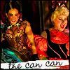
I made this image that I absolutely love (thanks to the banneresque tutorial i learned how to make this vintage stuff i love so very very much) check it out if you wanna its by Sherlock. so yea...okay anyway...here is the link...
Yay for cool vintage stuffs! Anyway...any help is appreciated! I want it to be a web layout so bad but I just can't figure out a good template or color scheme for it. Thanks a ton! |
|
|
|


|
Feb 3 2007, 08:08 AM
Post
#2
|
|
 talent on another level Group: Member Posts: 746 Joined: Oct 2006 Member No: 475,735 |
So basically you need a color scheme for the links, words, buttons etc. right? If so I would say use black, white, and pink, but since I don't know how you are gonna organize your page, I'm just suggesting using those colors. For the template, I would say make everything was even and wide as the banner you psted, but not to wide so it would look all even and carfully put to gether. Did that help?
|
|
|
|
|
Feb 3 2007, 12:19 PM
Post
#3
|
|
|
Yes You Can Can Can Group: Member Posts: 103 Joined: Dec 2006 Member No: 488,190 |
yeess!! im not sure what color to use for the background of the page, i was also thinking that maybe i could get the image to fade into the textarea part of the layout, but how do i go about doing that? Do you know? Does anyone else know? Bah! haha sorry I am asking so many questions, I am new at this game
|
|
|
|
|
Feb 3 2007, 01:32 PM
Post
#4
|
|
|
Yes You Can Can Can Group: Member Posts: 103 Joined: Dec 2006 Member No: 488,190 |
|
|
|
|
| *WHIMSICAL 0NE* |
Feb 3 2007, 02:16 PM
Post
#5
|
|
Guest |
Try not to double post, use the edit button.
I think it looks fine. I'm not a big fan of the fat borders, but I think that as long as you have enough content on the right it won't look weird. (I think it looks weird when there's a huge space and not enough content in that space). I think you should make the font of the "Navigation" and "Goodies", etc. the same. I really like the background you chose. 
|
|
|
|
|
Feb 3 2007, 03:08 PM
Post
#6
|
|
|
talent on another level Group: Member Posts: 746 Joined: Oct 2006 Member No: 475,735 |
i think a pink, white, and black pattern would look realy good in the background
|
|
|
|
|
Feb 3 2007, 03:22 PM
Post
#7
|
|
 Senior Member Group: Member Posts: 192 Joined: Jan 2007 Member No: 499,764 |
it looks nice now; although maybe you should align everything to the right or left vs. the center. i dunno, it just seems classier to me =]
|
|
|
|
|
Feb 3 2007, 03:46 PM
Post
#8
|
|
|
Yes You Can Can Can Group: Member Posts: 103 Joined: Dec 2006 Member No: 488,190 |
hey thanks for your suggestions! i really like the background pattern idea, and yea I think I need to move it over to the side also, I agree that the navigation text needs to be the same too now that you mention it! thanks so much!! *runs off to make a background*
|
|
|
|
|
Feb 3 2007, 09:52 PM
Post
#9
|
|
 gazette.cassis Group: Member Posts: 236 Joined: Dec 2004 Member No: 73,433 |
Yeah, a nice background pattern would be nice (Squidfingers.com has some good premade ones). One suggestion if I may say, you should make your site title stand out more. You have it faded in with your layout image which is fine, but it's a tad too unnoticeable, so I'd put a shadow on it, or make it slightly bigger.
Nice job though :D |
|
|
|

|
Feb 4 2007, 04:30 PM
Post
#10
|
|
|
Yes You Can Can Can Group: Member Posts: 103 Joined: Dec 2006 Member No: 488,190 |
So this is where I am at right now....
Yeeaa... But I am not happy because 1. I hate the page font and I'm not sure how to change it (I don't have dreamweaver or frontpage so I am coding my layout like...with nothing right now how can I change the font and find a better way to code this) 2. I want 2 blogs and I want the blog area to keep repeating but how can I do that with a patterned background on it 3. I want it to the side but it looks messed up as a one blog thing so I need to know how to code the background pattern and the repeating blog (to get the blog thing I would have a banner thing and then have a thin image as the background and do repeat-y) Any ideas? Thanks for all the help by the way I reeeeaaaally appreciate it! *EDIT* NEVERMIND I FIGURED IT OUT HAHA |
|
|
|
|
1 User(s) are reading this topic (1 Guests and 0 Anonymous Users)
0 Members: