Yeah Yeah Yeahs, I'm Tired Of Creating... |
Resource Center Links
This Month's Contests | Hosts Looking for Hostees | Hostees looking for Hosts | BigBookofResources
Submission Guidelines
  |

 Feb 2 2007, 08:21 PM Feb 2 2007, 08:21 PM
Post
#1
|
|
|
Senior Member  Group: Staff Alumni Posts: 1,188 Joined: Jan 2006 Member No: 364,198 |
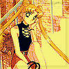
Gah, I hope I didn't do a bad job on this one. Preview here.
|
|
|
|


|
Feb 2 2007, 08:27 PM
Post
#2
|
|
 Senior Member Group: Official Member Posts: 7,149 Joined: Aug 2005 Member No: 213,509 |
I like this one, :D. Everything's nic and I liek the color burst.
|
|
|
|


|
Feb 2 2007, 09:42 PM
Post
#3
|
|
 show me a garden thats bursting to life Group: Staff Alumni Posts: 12,303 Joined: Mar 2005 Member No: 115,987 |
K, honey. I think you're abusing your powers just a bit. Stop closing your threads just because a couple o' people said it looks bad! It's all part of the learning experience. 'Sides, the thread'll die eventually and it'll be lost in the deep dark abyss of the server. It's all good.
But in the meantime, DAMN! I love this! |
|
|
|


|
Feb 2 2007, 10:01 PM
Post
#4
|
|
|
Senior Member Group: Staff Alumni Posts: 1,188 Joined: Jan 2006 Member No: 364,198 |
^Thank you both. Sorry Kristina, I was frustrated after I read the replies because I had spent all of my effort and creativeness into that one image and then it took those two replies for me to see that "What the hell was I doing?". I also hate leaving a topic open because the image exceeds my bandwidth by showcasing.

|
|
|
|
|
Feb 2 2007, 10:10 PM
Post
#5
|
|
|
t-t-t-toyaaa Group: Official Member Posts: 19,821 Joined: Apr 2004 Member No: 11,270 |
^ I have one suggestions: Stop being so hard on yourself. It was just me and Holly. Look how many other people could reply and have different opinions. When you design whatever you do, you should do it for yourself not to please other people. If me and Holly or whoever else have bad opinions on it , don't stop others from doing it. USE IT IF YOU WANT TOO! REBEL! (why the hell did I type that?) I was dissapointed when you closed it , I felt bad.
 And I like this, I would make the flower smaller? But I still like it. 
|
|
|
|

|
Feb 2 2007, 10:36 PM
Post
#6
|
|
|
Senior Member Group: Staff Alumni Posts: 1,188 Joined: Jan 2006 Member No: 364,198 |
^I'm sorry Toya. I guess I was just upset because as I stated earlier, I really tried and I had no idea it was too random and out of place.
Thanks!
|
|
|
|
| *Intercourse.* |
Feb 3 2007, 04:37 AM
Post
#7
|
|
Guest |
I agree with Kristina and Toya, seriously if we don't like it then its our opinion. If you like it then thats great
 I think this one looks great as well, honest. |
|
|
|
|
Feb 3 2007, 12:29 PM
Post
#8
|
|
|
Senior Member Group: Staff Alumni Posts: 1,188 Joined: Jan 2006 Member No: 364,198 |
^Thanks Holly.
|
|
|
|
|
Feb 3 2007, 12:33 PM
Post
#9
|
|
 x_pinaystyle_x Group: Member Posts: 472 Joined: Jan 2006 Member No: 366,326 |
wow!! that's pretty cool!
|
|
|
|

|
Feb 3 2007, 03:28 PM
Post
#10
|
|
 I intend to live forever-so far, so good. Group: Member Posts: 2,820 Joined: Mar 2005 Member No: 115,137 |
I'm usually a big fan of your work
which says a lot because I'm REALLY big on criticizing/hating on ppl's art. If I don't like something I'm not afraid to say so. The only critique I have for most of your work is that it's too empty. You have very nice ideas placements pictures and such, but the images you use are too spread out or a large area making it look incomplete. Also, I find you usually have a very dark pattern in the background that is too busy and brings away from the foreground. For your Yeah Yeah Yeahs peice, I don't quite understand the title lol and but besides that I think you did really well. The color scheme is nice, the image placement is well done, the bg and brushes dont take away from the piece. GJ this time Don't be so hard hard on yourself  your a great artist, but trust me, you'd rather get good critique than everyone lying and giving you no critque at all your a great artist, but trust me, you'd rather get good critique than everyone lying and giving you no critque at all
|
|
|
|

|
Feb 3 2007, 03:42 PM
Post
#11
|
|
|
Senior Member Group: Staff Alumni Posts: 1,188 Joined: Jan 2006 Member No: 364,198 |
^Thank you Maryland. It's hard whenever I do create something and I go to far, but I get the same critiques as if I didn't add enough. I guess I can never stay in between (going out there and not doing enough - being empty).
|
|
|
|
|
Feb 3 2007, 07:40 PM
Post
#12
|
|
|
Newbie Group: Member Posts: 4 Joined: Feb 2007 Member No: 500,537 |
besides that fact that this style is becoming so cliche,
I like it. |
|
|
|
|
Feb 3 2007, 07:44 PM
Post
#13
|
|
|
Senior Member Group: Staff Alumni Posts: 1,188 Joined: Jan 2006 Member No: 364,198 |
^Yea, I think I am going to completely stop creating collage designs. It seems I can never make them right.

|
|
|
|
|
Feb 3 2007, 08:08 PM
Post
#14
|
|
|
I intend to live forever-so far, so good. Group: Member Posts: 2,820 Joined: Mar 2005 Member No: 115,137 |
QUOTE(CABLE @ Feb 3 2007, 6:40 PM)  besides that fact that this style is becoming so cliche, I like it. name a style that is NOT cliche 
|
|
|
|
| *Kathleen* |
Feb 3 2007, 08:49 PM
Post
#15
|
|
Guest |
As much as I don't like the Yeah Yeah Yeahs, this is a nice banner!
I agree with Toya, though -- I think the flower's a tad too large.  It detracts too much from the images of the band. It detracts too much from the images of the band.
|
|
|
|
|
Feb 8 2007, 05:00 PM
Post
#16
|
|
|
I'm Cattt. :] Group: Validating Posts: 1,722 Joined: Apr 2005 Member No: 130,831 |
The right side look like a bunch of emptiness. Add some flowers or something there like the other side.
It look like the right side was extended out to compensate the text. |
|
|
|
| *StanleyThePanda* |
Feb 9 2007, 11:02 AM
Post
#17
|
|
Guest |
I agree with Toya, about the flower. It is a tad too big.
I really like the colors used though, and everything (but the flower) fits so well. Nice job.
|
|
|
|
| *mzkandi* |
Feb 9 2007, 03:12 PM
Post
#18
|
|
Guest |
I actually don't see anything wrong with the size of the flower. Mostly because it balances out the emptiness on the top right. But it looks like something should be there. Overall, I like it. But I'm partial because I love the Yeah, Yeah, Yeahs.
|
|
|
|
|
Feb 20 2007, 01:27 PM
Post
#19
|
|
 Senior Member Group: Member Posts: 1,584 Joined: Dec 2004 Member No: 70,748 |
i like it...good use of brushes and i like the dark colors
|
|
|
|
|
1 User(s) are reading this topic (1 Guests and 0 Anonymous Users)
0 Members: