Preview |
Resource Center Links
This Month's Contests | Hosts Looking for Hostees | Hostees looking for Hosts | BigBookofResources
Submission Guidelines
  |

 Jan 29 2006, 02:54 PM Jan 29 2006, 02:54 PM
Post
#1
|
|
|
t-t-t-toyaaa  Group: Official Member Posts: 19,821 Joined: Apr 2004 Member No: 11,270 |
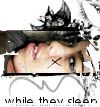
Hm I made this but not sure whether or not its worth coding.. Opinions welcome. I know theres alot of texture but I sort of want it that way
 Other things:   Plain Gilmore Girls Icons: ( I know I suck at icons but I'm getting better  ) )           
|
|
|
|


|
Jan 29 2006, 03:04 PM
Post
#2
|
|
 Senior Member Group: Member Posts: 3,055 Joined: Jul 2005 Member No: 174,796 |
Whoa talk about stretching the page.
I like the icons a lot they're vintage and not too complex and not too simple but i don't like the brush on the first one=] The first one looks pretty good but I don't like how there is grey on the sides. The second one looks great I love the blending style and you used good pics. I like the third the best. It's grungy, I like the style of blending, and the font-but I think you used a bit to much texture/fiters Good work 
|
|
|
|


|
Jan 29 2006, 03:04 PM
Post
#3
|
|
 I intend to live forever-so far, so good. Group: Member Posts: 2,820 Joined: Mar 2005 Member No: 115,137 |
the layout is really nice, the blending is grrat, i htink the gradient is juss a lil too overpowering
i love all your icons =) |
|
|
|

|
Jan 29 2006, 03:06 PM
Post
#4
|
|
 Senior Member Group: Member Posts: 170 Joined: Jan 2006 Member No: 351,851 |
fantastic stuff. I love the jessica alba blend.
|
|
|
|
|
Jan 29 2006, 03:18 PM
Post
#5
|
|
|
t-t-t-toyaaa Group: Official Member Posts: 19,821 Joined: Apr 2004 Member No: 11,270 |
Oh thanks
 Would this be better? With less gradient? 
|
|
|
|
|
Jan 29 2006, 03:27 PM
Post
#6
|
|
 Senior Member Group: Official Member Posts: 7,149 Joined: Aug 2005 Member No: 213,509 |
i love the layout.i think its worth coding.your blends are wonderful and awesome icons.great job.
|
|
|
|

|
Jan 29 2006, 04:02 PM
Post
#7
|
|
|
I intend to live forever-so far, so good. Group: Member Posts: 2,820 Joined: Mar 2005 Member No: 115,137 |
the edited one looks much better
|
|
|
|
|
Jan 29 2006, 04:23 PM
Post
#8
|
|
 Are You Kidding? Group: Member Posts: 1,714 Joined: Sep 2005 Member No: 237,747 |
I love the layout thingy so vintage.
The icons rock. In the 1st icon her head is kinda squish. I love the yellow and pink color that u used in the other thing. I dont really like the Jessica Alba one. Awesome Job. |
|
|
|
|
Jan 29 2006, 05:58 PM
Post
#9
|
|
 young enough to not give a f*ck Group: Member Posts: 1,149 Joined: Jul 2004 Member No: 35,060 |
i like everything. just the icons..their faces are all stretched out?
|
|
|
|

|
Jan 29 2006, 06:29 PM
Post
#10
|
|
 Senior Member Group: Member Posts: 277 Joined: Jul 2005 Member No: 172,698 |
in the layout, you used too many textures....tone it down a teeney tiny bit. I love everything else :D
|
|
|
|
|
Jan 29 2006, 10:29 PM
Post
#11
|
|
 Milo Kamalani Group: Human Posts: 954 Joined: Oct 2005 Member No: 274,798 |
Oh the gilmore girl icons are great!
The first image is really pretty, reminds me of Shakespeare's time. |
|
|
|

|
Jan 30 2006, 07:25 PM
Post
#12
|
|
 the name is ada. Group: Official Member Posts: 4,688 Joined: Dec 2005 Member No: 334,608 |
Omg you`re hecka talented.
Love the icons. Love the vintagey Look. |
|
|
|
|
Jan 30 2006, 07:46 PM
Post
#13
|
|
 Senior Member Group: Member Posts: 1,584 Joined: Dec 2004 Member No: 70,748 |
i like the editted layout better..also..i love the jessica alba blend..the grungy texture is awesome..but..the big head at the bottom is very distracting and out of place...its just a big head placed at the very bottom O.o..i love ur icons...theyre so cute/funny
|
|
|
|
|
1 User(s) are reading this topic (1 Guests and 0 Anonymous Users)
0 Members: