first attempt~, yup.. PS, my first try.. |
Resource Center Links
This Month's Contests | Hosts Looking for Hostees | Hostees looking for Hosts | BigBookofResources
Submission Guidelines
  |

 Jan 2 2006, 12:51 AM Jan 2 2006, 12:51 AM
Post
#1
|
|
|
this is lia~  Group: Member Posts: 9 Joined: Nov 2004 Member No: 65,135 |
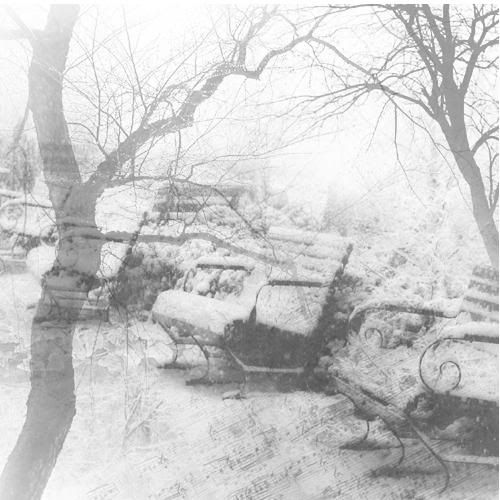   (wow.. the images look bigger >.< .. oh well.. ) anyways, these are my first (horrible, hm?) attempts at photoshop.. ^^; please help me improve.. comments and criticism, please. |
|
|
|


|
Jan 2 2006, 12:59 AM
Post
#2
|
|
 You'll find me in your dreams. Group: Official Member Posts: 8,536 Joined: Mar 2005 Member No: 114,010 |
Always make the effort to list credits. Don't overlap the brushes too much&add color. Lot of color. Color is good. Also, don't be afraid to play around with the effects, patterns, and gradients! They add style and flair to your artwork. Very good attempts though, just make that extra little bit of effort!
|
|
|
|

|
Jan 2 2006, 01:02 AM
Post
#3
|
|
|
this is lia~ Group: Member Posts: 9 Joined: Nov 2004 Member No: 65,135 |
ah~ thank you fishcake-y.. I'll work more on that! ^^
|
|
|
|
|
Jan 2 2006, 01:02 AM
Post
#4
|
|
 ^ignore. read> Maria. Group: Member Posts: 710 Joined: Dec 2005 Member No: 323,799 |
i think those are very good! especially for first attempt. very nice pics! umm... idk what to say to help you improve though.... for these, its probably better off like this, but mosts look really good with textures, brushes, and borders
|
|
|
|
|
Jan 2 2006, 01:14 AM
Post
#5
|
|
|
You'll find me in your dreams. Group: Official Member Posts: 8,536 Joined: Mar 2005 Member No: 114,010 |
Welcome. &m.ar.i.a, they're brushes. Which is why they're all back&white. A few more tidbits...
Adding text can make your artwork a thousand times better. Choosing the right font is also very helpful. Also, adding borders is a good practice to take up. You don't always need a full border, sometimes a half border looks good too. Use your judgement when adding them, some pieces don't need borders at all. |
|
|
|
|
Jan 2 2006, 01:02 PM
Post
#6
|
|
 Senior Member Group: Member Posts: 3,055 Joined: Jul 2005 Member No: 174,796 |
Those are lovely
 But the last one is a bit clutterish, try using less brushes. |
|
|
|

|
Jan 2 2006, 01:04 PM
Post
#7
|
|
 when you smile, i melt inside Group: Member Posts: 1,325 Joined: Oct 2005 Member No: 267,089 |
^
I agree. Good job, though. :] |
|
|
|


|
Jan 2 2006, 02:21 PM
Post
#8
|
|
 Yea Yea. Group: Member Posts: 837 Joined: Jan 2005 Member No: 79,366 |
I like them but it seems like the brushes overlap too much. I think someone said that.
|
|
|
|

|
Jan 2 2006, 02:56 PM
Post
#9
|
|
 I love you Group: Member Posts: 194 Joined: Mar 2005 Member No: 116,447 |
I really like them. They're good for your first attempt
|
|
|
|

|
Jan 2 2006, 04:08 PM
Post
#10
|
|
 who ma bitch? you ma bitch, bitch. Group: Member Posts: 1,920 Joined: Oct 2004 Member No: 55,278 |
QUOTE(fishcake-y @ Jan 1 2006, 9:59 PM) Always make the effort to list credits. Don't overlap the brushes too much&add color. Lot of color. Color is good. Also, don't be afraid to play around with the effects, patterns, and gradients! They add style and flair to your artwork. Very good attempts though, just make that extra little bit of effort!  ditto 
|
|
|
|
|
Jan 2 2006, 04:20 PM
Post
#11
|
|
 Diana =] Group: Member Posts: 1,318 Joined: Jul 2005 Member No: 174,147 |
They're good for a first attempt
|
|
|
|
|
Jan 2 2006, 09:06 PM
Post
#12
|
|
|
this is lia~ Group: Member Posts: 9 Joined: Nov 2004 Member No: 65,135 |
thank you everybody.. I'll be sure to do (or try to do..) these things.. glad you thought it was ok!
|
|
|
|
|
Jan 2 2006, 09:11 PM
Post
#13
|
|
 Yawn Group: Staff Alumni Posts: 9,530 Joined: Nov 2004 Member No: 65,772 |
I think they are all beautiful. Especially the first and second one.
And actually i like the fact that it's black and white. It adds a little something that color can't do. You know? Great job with you first attempts :) |
|
|
|

|
Jan 3 2006, 06:31 PM
Post
#14
|
|
 :D Group: Member Posts: 530 Joined: Dec 2005 Member No: 337,031 |
I do like the 1st+2nd, but thee 3rd is alittle cluttered like people are saying, and I think the 2nd would look good with color, but I thin the 1st one is great!
Good job for a first attempt! |
|
|
|

|
1 User(s) are reading this topic (1 Guests and 0 Anonymous Users)
0 Members: