katie holmes blend, which do u like better? |
Resource Center Links
This Month's Contests | Hosts Looking for Hostees | Hostees looking for Hosts | BigBookofResources
Submission Guidelines
  |

 Dec 31 2005, 03:18 PM Dec 31 2005, 03:18 PM
Post
#1
|
|
 Yea Yea.  Group: Member Posts: 837 Joined: Jan 2005 Member No: 79,366 |
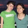
Just to let you know, I've been out of shape.. I haven't made a blend in like 7 months, no joke. So.. I wanted to make a nice blend for my sig. I made two with different types of colorization. Tell me what you think of the blend & which you like better! CC is good too
    comments commentsedittt.. i spreaded the pictures more apart in the blend & changed some colorization stuff. AFTER   *I think the first one is much better but the second one was cool & fun to make. Comments on the new blend please 
|
|
|
|


|
Dec 31 2005, 03:24 PM
Post
#2
|
|
 when you smile, i melt inside Group: Member Posts: 1,325 Joined: Oct 2005 Member No: 267,089 |
I kind of like the gradient in the second one, but I think the pictures are too close together. I'd say the second one is better. Good job. :]
|
|
|
|


|
Dec 31 2005, 03:47 PM
Post
#3
|
|
 Diana =] Group: Member Posts: 1,318 Joined: Jul 2005 Member No: 174,147 |
the top one looks better. the second one is too crazy.. makes me dizzy
|
|
|
|
|
Dec 31 2005, 03:47 PM
Post
#4
|
|
|
t-t-t-toyaaa Group: Official Member Posts: 19,821 Joined: Apr 2004 Member No: 11,270 |
To me the first ones better. Only because I don't really like the gradient. If you want a gradient to look better try making a new layer and making a gradient over the whole image.
As a suggestion try not to stretch your pictures (wish you did in the final picture). Also try to give them a little space to breathe the first two are too close and it seems like your trying to make the third one get in close by stretching it. |
|
|
|

|
Dec 31 2005, 03:50 PM
Post
#5
|
|
 who ma bitch? you ma bitch, bitch. Group: Member Posts: 1,920 Joined: Oct 2004 Member No: 55,278 |
the blendiing job looks weird
 it kinda cuts her in half. try a way of blending the images. for example feathering it'll make it look ten times better. |
|
|
|
|
Dec 31 2005, 04:31 PM
Post
#6
|
|
 the name is ada. Group: Official Member Posts: 4,688 Joined: Dec 2005 Member No: 334,608 |
I like the 2nd one best! I love the colors.
|
|
|
|
|
Dec 31 2005, 04:33 PM
Post
#7
|
|
|
Yea Yea. Group: Member Posts: 837 Joined: Jan 2005 Member No: 79,366 |
QUOTE(CUTEBUNNY160 @ Dec 31 2005, 3:50 PM) the blendiing job looks weird it kinda cuts her in half. try a way of blending the images. for example feathering it'll make it look ten times better.  it was feathered 
|
|
|
|
|
Dec 31 2005, 05:39 PM
Post
#8
|
|
 Senior Member Group: Member Posts: 3,055 Joined: Jul 2005 Member No: 174,796 |
I like the second one better.
But I don't see really alot of "blending" it's more like pictures just put together. But I understand, you haven't made one in like 7 months |
|
|
|

|
Dec 31 2005, 05:47 PM
Post
#9
|
|
 Peggy. Group: Member Posts: 2,508 Joined: Aug 2005 Member No: 214,025 |
I like the 1st one of the "after" part more.
Anyways, the best one is from your signature... |
|
|
|

|
1 User(s) are reading this topic (1 Guests and 0 Anonymous Users)
0 Members: