Harry Potter, Fourth Movie |
Resource Center Links
This Month's Contests | Hosts Looking for Hostees | Hostees looking for Hosts | BigBookofResources
Submission Guidelines
  |

 Nov 27 2005, 08:18 PM Nov 27 2005, 08:18 PM
Post
#1
|
|
 Proud to be an Anime Otaku  Group: Member Posts: 667 Joined: Jul 2005 Member No: 165,004 |
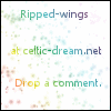
Just want some opinions before I code this web layout. It's of Harrp, Cho, and Hermionie. It's called "Two loves. One choice." A bit cheesy but oh well. A bit of inspiration from Here for the Yule ball images and HP 4. So, here it is constructive critque please:

|
|
|
|


|
Nov 27 2005, 08:23 PM
Post
#2
|
|
 I intend to live forever-so far, so good. Group: Member Posts: 2,820 Joined: Mar 2005 Member No: 115,137 |
the blend is super nice! Im so dumb when it comes to layouts tho lol it looks to me like it will make a super awesome layout. gj
 ..um the straight line bisecting "blog and links" kinda is over run at the top and bottom ..um the straight line bisecting "blog and links" kinda is over run at the top and bottom  im picky im picky
|
|
|
|

|
Nov 27 2005, 08:33 PM
Post
#3
|
|
|
Proud to be an Anime Otaku Group: Member Posts: 667 Joined: Jul 2005 Member No: 165,004 |
Thankies, the line I'm deciding to keep that way. I might change it. Might. I'm not sure yet.
|
|
|
|
|
Nov 27 2005, 09:51 PM
Post
#4
|
|
 Nobody Knows Your Heart. Group: Member Posts: 388 Joined: Jul 2004 Member No: 34,906 |
I like the Harry/Cho part ;DD
I'm not a fan of Harry/Hermione >< It's nice ;) |
|
|
|

|
Nov 27 2005, 09:54 PM
Post
#5
|
|
 sang loves hayden. Group: Staff Alumni Posts: 3,373 Joined: Feb 2004 Member No: 5,687 |
Nice blending. The quote/title is very interesting, and it definitely goes with the theme/pictures. It would be nice if you code it as a layout. In my opinion, the word link/blog looks kind of boring and the font. (x
|
|
|
|

|
Nov 27 2005, 10:12 PM
Post
#6
|
|
|
Proud to be an Anime Otaku Group: Member Posts: 667 Joined: Jul 2005 Member No: 165,004 |
QUOTE I like the Harry/Cho part ;DD I'm not a fan of Harry/Hermione >< It's nice ;) Thankies but I'm pro Hermione. Yeppers. QUOTE Nice blending. The quote/title is very interesting, and it definitely goes with the theme/pictures. It would be nice if you code it as a layout. In my opinion, the word link/blog looks kind of boring and the font. (x I wanted the blending to be the most interesting part lol, the others are kinda just their, I didn't want them to be more extrvagent than the header ^^ |
|
|
|
|
Nov 28 2005, 06:56 AM
Post
#7
|
|
 yan lin♥ Group: Staff Alumni Posts: 14,129 Joined: Apr 2004 Member No: 13,627 |
i dont really like the blue or the font. but the blending is nice.
|
|
|
|

|
Nov 28 2005, 03:26 PM
Post
#8
|
|
|
Proud to be an Anime Otaku Group: Member Posts: 667 Joined: Jul 2005 Member No: 165,004 |
QUOTE(yanners @ Nov 28 2005, 6:56 AM) i dont really like the blue or the font. but the blending is nice.  The font is Time New Roman and I spent maybe four hours? pouring over fonts and none seemed to work so I settled for this. Not to flashy but it works well. And blue is my favorite color lol. It matches me well? |
|
|
|
|
Nov 28 2005, 05:32 PM
Post
#9
|
|
|
Senior Member Group: Member Posts: 35 Joined: Feb 2005 Member No: 104,752 |
I absolutely LOVEEEE it.
I'm a harry potter fanatic. and I love everyhitn about it excepttt.. where's ron? =[ lol |
|
|
|
|
Nov 28 2005, 05:53 PM
Post
#10
|
|
 who ma bitch? you ma bitch, bitch. Group: Member Posts: 1,920 Joined: Oct 2004 Member No: 55,278 |
i like it. great job on the blending
|
|
|
|
|
Nov 28 2005, 06:53 PM
Post
#11
|
|
|
Proud to be an Anime Otaku Group: Member Posts: 667 Joined: Jul 2005 Member No: 165,004 |
QUOTE(forgotten_farewell @ Nov 28 2005, 5:32 PM) I absolutely LOVEEEE it. I'm a harry potter fanatic. and I love everyhitn about it excepttt.. where's ron? =[ lol Hey I'm an HP fanatic too!!!!!!! But Ron's not their because it's about harry's love and I hope Ron isn't one of them. I'm not into the relationnship between them like others. (I'm not saying you are!!!!) And thankies cutebunny my blending skills have imporved by far ^^ |
|
|
|
|
Nov 28 2005, 06:56 PM
Post
#12
|
|
 Senior Member Group: Official Designer Posts: 4,591 Joined: Dec 2004 Member No: 77,305 |
QUOTE(yanners @ Nov 28 2005, 6:56 AM) i dont really like the blue or the font. but the blending is nice. Ditto. The blue is too much. |
|
|
|


|
Nov 28 2005, 07:00 PM
Post
#13
|
|
|
Proud to be an Anime Otaku Group: Member Posts: 667 Joined: Jul 2005 Member No: 165,004 |
QUOTE(Szeh @ Nov 28 2005, 6:56 PM) Ditto. The blue is too much. Well, what othe rcolor should I put? Some advice please? |
|
|
|
|
Nov 28 2005, 07:10 PM
Post
#14
|
|
|
Senior Member Group: Official Designer Posts: 4,591 Joined: Dec 2004 Member No: 77,305 |
Something that matches blue?
|
|
|
|
|
Nov 28 2005, 07:27 PM
Post
#15
|
|
 show me a garden thats bursting to life Group: Staff Alumni Posts: 12,303 Joined: Mar 2005 Member No: 115,987 |
I dont like the seperation between the Links and Blog. Idk why though..
It's nice otherwise. THE BLUES GREAT! 
|
|
|
|


|
Nov 28 2005, 08:41 PM
Post
#16
|
|
|
im thinker than you smart i am. Group: Member Posts: 640 Joined: Mar 2005 Member No: 118,093 |
very good blend. i like the blue.
i dotn think harry likes hermione, though, justt cho. lol. |
|
|
|
|
Nov 28 2005, 10:15 PM
Post
#17
|
|
|
Proud to be an Anime Otaku Group: Member Posts: 667 Joined: Jul 2005 Member No: 165,004 |
I think I shoulda put Ginny eh? But him and Cho stop liking each other........(HP FREAK RUN!) and I'll stay woith the blue, but since I have little time to make this into a web layout, I'll have to wait until Thursday because of Power Of The Pen.
|
|
|
|
|
Nov 28 2005, 11:16 PM
Post
#18
|
|
 Peggy. Group: Member Posts: 2,508 Joined: Aug 2005 Member No: 214,025 |
I like it, but the font is too simple for this awesome layout!
|
|
|
|

| *stephinika* |
Nov 28 2005, 11:51 PM
Post
#19
|
|
Guest |
not bad. simple layout, and i'm not a harry/hermione fan, but the layout is pretty good.
|
|
|
|
|
Nov 29 2005, 10:26 PM
Post
#20
|
|
 ...who created this mess...? Group: Member Posts: 451 Joined: Feb 2005 Member No: 97,244 |
I really like this! The only thing I think you should have changed is the font. I would have chosen a more.. "curly" font or something. Anyways, the colors are awesome and so are the pictures you put together. =]
|
|
|
|
|
Nov 29 2005, 11:18 PM
Post
#21
|
|
 hello : ) Group: Official Member Posts: 4,227 Joined: Apr 2004 Member No: 13,139 |
Hmm. Well if you were to stick more to the novel of Harry Potter you wouldn't have used Hermoine in the blend because JK Rowling makes it clear that they will not get together and that eventually she will be with Ron. She's been building up that relationship in several books now. Also, Harry stops liking Cho later on. Anyways though, on the actual layout, I think that it's too much blue. The blending is pretty good and like Yanners said, I don't particularly like the font. Oh, I also think there is too much space for the links and not enough for the blog. It just looks a bit odd. Also, I don't like the way you divided it. The line is too defined. Maybe lower the opacity of it.
|
|
|
|

|
Nov 30 2005, 06:17 AM
Post
#22
|
|
|
Proud to be an Anime Otaku Group: Member Posts: 667 Joined: Jul 2005 Member No: 165,004 |
QUOTE(M1SSxCHR1SSY @ Nov 29 2005, 11:18 PM) Hmm. Well if you were to stick more to the novel of Harry Potter you wouldn't have used Hermoine in the blend because JK Rowling makes it clear that they will not get together and that eventually she will be with Ron. She's been building up that relationship in several books now. Also, Harry stops liking Cho later on. Anyways though, on the actual layout, I think that it's too much blue. The blending is pretty good and like Yanners said, I don't particularly like the font. Oh, I also think there is too much space for the links and not enough for the blog. It just looks a bit odd. Also, I don't like the way you divided it. The line is too defined. Maybe lower the opacity of it. I know that later on Harry and Cho aren't going to be together nor Hermione, but, I chose to do alternate pairings instead of canons. I'm not to fond of the Ginny/Harry pairing. Since there aren't any pictures of them when they do get together. Besides it's like my Sesshoumaru/Kagome fanfics in layout form. |
|
|
|
|
Nov 30 2005, 09:34 AM
Post
#23
|
|
 Oreo Nazi >=) Group: Member Posts: 234 Joined: Oct 2005 Member No: 281,794 |
Nice blend. I think the blue is too much though. I'd probably have to agree with what's already said. The blend part is really well done though.
|
|
|
|
|
Nov 30 2005, 07:39 PM
Post
#24
|
|
 something more Group: Member Posts: 2,468 Joined: Mar 2004 Member No: 8,808 |
Nice! I don't really like the Links and Blog part, but i love the banner!
|
|
|
|
|
1 User(s) are reading this topic (1 Guests and 0 Anonymous Users)
0 Members: