Random iicons, Um, they're random? |
Resource Center Links
This Month's Contests | Hosts Looking for Hostees | Hostees looking for Hosts | BigBookofResources
Submission Guidelines
  |

 Nov 25 2005, 07:55 PM Nov 25 2005, 07:55 PM
Post
#1
|
|
 Proud to be an Anime Otaku  Group: Member Posts: 667 Joined: Jul 2005 Member No: 165,004 |
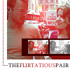
Well, I was just fiddeling around with PSP and I came up with some of these icons, they're veru veru very simple so don't expect anything extravagent. Anyway here they are:
 This image has profanity and if you don't wish to see it don't click this link, so do not blame me if you click this link, I understand there are people who'd rather not see profanity and I respect that so only click the link if you wish to be held responsible for what you are viwing I only made it i did not force you to view it. Hehe I had to add all that.  Okay there we go. So some feedback would be nice and no flames ^^. Feel free to use them ^^ as long as you give me credit if used on a site. [Edit] Okay here's a new polaroid one I think is a bit more better, no shadows or anything, it's very I repeat VERY plain thank you and here it is: 
|
|
|
|


|
Nov 25 2005, 08:01 PM
Post
#2
|
|
 who ma bitch? you ma bitch, bitch. Group: Member Posts: 1,920 Joined: Oct 2004 Member No: 55,278 |
try adding a border and some brushes
|
|
|
|
|
Nov 25 2005, 08:04 PM
Post
#3
|
|
 I intend to live forever-so far, so good. Group: Member Posts: 2,820 Joined: Mar 2005 Member No: 115,137 |
i like the profanity one the best
 um dont put a big bg part behind the text, juss put the text over the picture. |
|
|
|

|
Nov 26 2005, 12:04 AM
Post
#4
|
|
 My name is really Matt... if you care. Group: Member Posts: 1,442 Joined: Oct 2005 Member No: 258,234 |
they kinda look like poloroids
|
|
|
|
|
Nov 27 2005, 04:19 PM
Post
#5
|
|
 & my dreams fall down Group: Member Posts: 1,173 Joined: Nov 2005 Member No: 291,336 |
i like them but where did u get the photo white part from?? i have been looking all over for those...well thanxs if u can tell me where u got them from
|
|
|
|

|
Nov 27 2005, 05:32 PM
Post
#6
|
|
|
Proud to be an Anime Otaku Group: Member Posts: 667 Joined: Jul 2005 Member No: 165,004 |
QUOTE they kinda look like poloroids They're spose too. QUOTE i like them but where did u get the photo white part from?? i have been looking all over for those...well thanxs if u can tell me where u got them from I made them, then put a picture in the layout of the polaroid.. It's not a brush or anything, at least not the one I used. Mine sucked so I'm still trying. I might make min into a brush for my computer though......*thoughtful look* |
|
|
|
|
Nov 27 2005, 05:36 PM
Post
#7
|
|
 Senior Member Group: Member Posts: 1,584 Joined: Dec 2004 Member No: 70,748 |
lol..i like the profanity one even tho im not a fan of it

|
|
|
|
|
Nov 27 2005, 06:00 PM
Post
#8
|
|
 Peggy. Group: Member Posts: 2,508 Joined: Aug 2005 Member No: 214,025 |
The profanity one is the best, the other two are simply copy and pasting plus text.
|
|
|
|


|
Nov 27 2005, 08:15 PM
Post
#9
|
|
|
Proud to be an Anime Otaku Group: Member Posts: 667 Joined: Jul 2005 Member No: 165,004 |
What about the fact I pasted them on polaroids I made? I think that counts as something. I made the polaroids, colorized the pictures, with gradients and blending, then pasted them onto the poloroid brushes I made. And the text. Uhhhhh?
|
|
|
|
|
Nov 27 2005, 09:31 PM
Post
#10
|
|
 boo Group: Member Posts: 5,512 Joined: Dec 2004 Member No: 71,765 |
For the polaroids one, maybe you should drop some shadow to make it more realistic. Yup
|
|
|
|
|
Nov 27 2005, 09:33 PM
Post
#11
|
|
 Nobody Knows Your Heart. Group: Member Posts: 388 Joined: Jul 2004 Member No: 34,906 |
Nice, but they look a bit too plain.
|
|
|
|

|
Nov 27 2005, 09:48 PM
Post
#12
|
|
|
Proud to be an Anime Otaku Group: Member Posts: 667 Joined: Jul 2005 Member No: 165,004 |
QUOTE(liloandstitchx3 @ Nov 27 2005, 9:33 PM) Nice, but they look a bit too plain.  I did say they weren't extravagent. Look I aded another! |
|
|
|
|
Nov 27 2005, 09:50 PM
Post
#13
|
|
 sang loves hayden. Group: Staff Alumni Posts: 3,373 Joined: Feb 2004 Member No: 5,687 |
I really like the profanity one. In my opinion, I think it was a nice choice of font type with the grunge background. (=
|
|
|
|

|
Nov 27 2005, 10:10 PM
Post
#14
|
|
|
Proud to be an Anime Otaku Group: Member Posts: 667 Joined: Jul 2005 Member No: 165,004 |
Thankies, yeah I just did it in the spur of the moment, trying to design a layout that said something weird and yeah that icon was the result. no layout

|
|
|
|
|
Nov 27 2005, 10:32 PM
Post
#15
|
|
|
Nobody Knows Your Heart. Group: Member Posts: 388 Joined: Jul 2004 Member No: 34,906 |
I like. =)
|
|
|
|
|
Nov 28 2005, 06:19 AM
Post
#16
|
|
|
Proud to be an Anime Otaku Group: Member Posts: 667 Joined: Jul 2005 Member No: 165,004 |
QUOTE(liloandstitchx3 @ Nov 27 2005, 10:32 PM) I like. =) Thankies ^^ |
|
|
|
|
Nov 28 2005, 06:50 AM
Post
#17
|
|
 yan lin♥ Group: Staff Alumni Posts: 14,129 Joined: Apr 2004 Member No: 13,627 |
they're really really plain. even though you said that they're not supposed to be extravagant, i still think you should add something more to it.
|
|
|
|

|
Nov 28 2005, 08:46 PM
Post
#18
|
|
|
im thinker than you smart i am. Group: Member Posts: 640 Joined: Mar 2005 Member No: 118,093 |
they're good. but i think adding a border would make them look better. and the white space at the bottom of each one looks kinda weird. maybe you could blend it with with the picture...?
|
|
|
|
|
Dec 2 2005, 09:19 PM
Post
#19
|
|
 Senior Member Group: Member Posts: 2,614 Joined: Jan 2005 Member No: 85,903 |
I must say I do like these ones to.
|
|
|
|

|
1 User(s) are reading this topic (1 Guests and 0 Anonymous Users)
0 Members: