new icons |
Resource Center Links
This Month's Contests | Hosts Looking for Hostees | Hostees looking for Hosts | BigBookofResources
Submission Guidelines
  |

 Nov 15 2005, 12:04 AM Nov 15 2005, 12:04 AM
Post
#1
|
|
 Froggie! Woof woof. :D  Group: Member Posts: 1,423 Joined: Nov 2004 Member No: 66,146 |
newest-oldest
you guys can use if you want. =)       
|
|
|
|


|
Nov 15 2005, 12:06 AM
Post
#2
|
|
 Lurker. Group: Official Designer Posts: 2,161 Joined: Feb 2004 Member No: 3,851 |
Those are really nice. I thought the last one said "ouch me", but I loooked at it closer. LOL. I really like the first one. = ]
|
|
|
|

|
Nov 15 2005, 12:07 AM
Post
#3
|
|
|
Froggie! Woof woof. :D Group: Member Posts: 1,423 Joined: Nov 2004 Member No: 66,146 |
QUOTE(d4z3 @ Nov 14 2005, 9:06 PM) Those are really nice. I thought the last one said "ouch me", but I loooked at it closer. LOL. I really like the first one. = ]  lol. =D thanks though |
|
|
|
|
Nov 15 2005, 12:13 AM
Post
#4
|
|
 I come from East Oakland where the youngstas get hyphy! Group: Member Posts: 1,821 Joined: Feb 2005 Member No: 102,942 |
QUOTE(d4z3 @ Nov 14 2005, 9:06 PM) I thought the last one said "ouch me", but I loooked at it closer. LOL. I thought it said that too. I love em all. You are very good at graphic design . |
|
|
|
|
Nov 15 2005, 12:47 AM
Post
#5
|
|
 Yawn Group: Staff Alumni Posts: 9,530 Joined: Nov 2004 Member No: 65,772 |
lol yah i thought it said "Ouch Me" too. lol. maybe you should fix that one. Although Ouch Me does sound intriguing.
I really like that Beauty icon too, great job on these by the way! |
|
|
|

|
Nov 15 2005, 01:54 AM
Post
#6
|
|
|
Froggie! Woof woof. :D Group: Member Posts: 1,423 Joined: Nov 2004 Member No: 66,146 |
i'll try to edit ASAP
|
|
|
|
|
Nov 15 2005, 01:58 AM
Post
#7
|
|
 Don't wake ghostie. Group: Official Member Posts: 3,546 Joined: Jan 2004 Member No: 2,405 |
I really like your graphics. Those up there are awesome, I wish I could use one but they aren't really my style... (cries) Where do you find your pictures?
|
|
|
|
|
Nov 15 2005, 02:02 AM
Post
#8
|
|
|
Froggie! Woof woof. :D Group: Member Posts: 1,423 Joined: Nov 2004 Member No: 66,146 |
^ i get most of my images from blend challenge sites. xD
|
|
|
|
|
Nov 15 2005, 06:35 AM
Post
#9
|
|
 Proud to be an Anime Otaku Group: Member Posts: 667 Joined: Jul 2005 Member No: 165,004 |
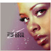
Prettyful! I love the one that says Bijoux it's lovely. (For some odd reason I felt a craving to say it's spanking O.o) Anywho, lovely lovely. You did a wonderful job on everyone of them. Though everyone already told you which one you could possibly misread. SO tis all for me.
|
|
|
|

|
Nov 15 2005, 04:23 PM
Post
#10
|
|
|
im thinker than you smart i am. Group: Member Posts: 640 Joined: Mar 2005 Member No: 118,093 |
i <3 the first three
|
|
|
|
|
Nov 15 2005, 05:01 PM
Post
#11
|
|
|
Don't wake ghostie. Group: Official Member Posts: 3,546 Joined: Jan 2004 Member No: 2,405 |
Is the girl in Bijoux Ashley Olsen?
|
|
|
|
|
Nov 15 2005, 05:07 PM
Post
#12
|
|
 Senior Member Group: Official Member Posts: 7,149 Joined: Aug 2005 Member No: 213,509 |
^looks like it,or marykate,but i love all your icons. :]
|
|
|
|

|
Nov 15 2005, 05:23 PM
Post
#13
|
|
 My name is really Matt... if you care. Group: Member Posts: 1,442 Joined: Oct 2005 Member No: 258,234 |
i love the feel of them. they are mellow and have that "vintage" look to them! great job.
keep up the good work for all our sakes! |
|
|
|
|
Nov 15 2005, 11:08 PM
Post
#14
|
|
 I intend to live forever-so far, so good. Group: Member Posts: 2,820 Joined: Mar 2005 Member No: 115,137 |
the colors of the first one is really nice
awesome job on all |
|
|
|

|
Nov 16 2005, 01:17 AM
Post
#15
|
|
|
Froggie! Woof woof. :D Group: Member Posts: 1,423 Joined: Nov 2004 Member No: 66,146 |
QUOTE(Retrogressive @ Nov 15 2005, 2:01 PM) Is the girl in Bijoux Ashley Olsen? yes |
|
|
|
|
Nov 16 2005, 01:21 AM
Post
#16
|
|
|
Don't wake ghostie. Group: Official Member Posts: 3,546 Joined: Jan 2004 Member No: 2,405 |
^HA knew it
Yes, I like your style a whole lot. I'm smoothing out mine around the edges. You should donate those to an avatar site, or start your own. |
|
|
|
| *stephinika* |
Nov 16 2005, 02:32 AM
Post
#17
|
|
Guest |
nice work, i have to say i quite like the overall look to them.

|
|
|
|
|
Nov 16 2005, 06:35 PM
Post
#18
|
|
 Milo Kamalani Group: Human Posts: 954 Joined: Oct 2005 Member No: 274,798 |
I love it when people make icons into art, <3.
|
|
|
|


|
Nov 16 2005, 07:21 PM
Post
#19
|
|
 What a hypocrite. Group: Member Posts: 2,754 Joined: Apr 2005 Member No: 128,150 |
Very rad indeed.
So, I was wondering. For the last icon, how did you put the teeny small letters inside of the big letters? Nobody answered my question when I asked before.
|
|
|
|
| *StanleyThePanda* |
Nov 16 2005, 10:25 PM
Post
#20
|
|
Guest |
Make the T darker on the "Touch me" one
but the others rock! 
|
|
|
|
|
Nov 16 2005, 10:55 PM
Post
#21
|
|
 ladybugs are hot <3 Group: Member Posts: 1,169 Joined: Jan 2005 Member No: 93,802 |
they are AWESOME! i lovee em =)
|
|
|
|
|
Nov 16 2005, 11:48 PM
Post
#22
|
|
 Peggy. Group: Member Posts: 2,508 Joined: Aug 2005 Member No: 214,025 |
I like all of the icons you have, so unique!
|
|
|
|

|
Nov 17 2005, 11:05 PM
Post
#23
|
|
|
Froggie! Woof woof. :D Group: Member Posts: 1,423 Joined: Nov 2004 Member No: 66,146 |
thanks. =)
|
|
|
|
|
Nov 18 2005, 12:38 PM
Post
#24
|
|
|
Don't wake ghostie. Group: Official Member Posts: 3,546 Joined: Jan 2004 Member No: 2,405 |
QUOTE(emazing @ Nov 16 2005, 7:21 PM) Very rad indeed. So, I was wondering. For the last icon, how did you put the teeny small letters inside of the big letters? Nobody answered my question when I asked before. I would just go into MS paint and make a text box over some larger text (make sure the text box isn't on the "clear bg" setting) and make smaller text on top.  Or just make "THAT'S HOT" a seperate layer, then cut a small section out of the middle (or divide the two halves of the word and move the top half down and the bottom half up) then get another layer to make the smaller text. (I'd use photoimpression, I'm not good with text on PSP8) This post has been edited by Retrogressive: Nov 18 2005, 12:40 PM |
|
|
|
|
Nov 18 2005, 10:37 PM
Post
#25
|
|
|
Froggie! Woof woof. :D Group: Member Posts: 1,423 Joined: Nov 2004 Member No: 66,146 |
QUOTE(emazing @ Nov 16 2005, 4:21 PM) Very rad indeed. So, I was wondering. For the last icon, how did you put the teeny small letters inside of the big letters? Nobody answered my question when I asked before. maybe i'll make a tutorial or something. x) |
|
|
|
|
1 User(s) are reading this topic (1 Guests and 0 Anonymous Users)
0 Members: