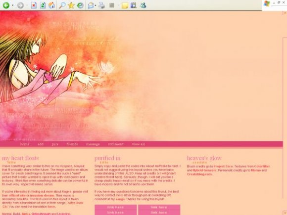
Designer's Comments
Look carefully for specific instructions
This layout has only been tested in Internet Explorer.
REPLACE XXXXXXX WITH YOUR FRIEND ID BEFORE YOU DO ANYTHING.
Any questions, yell at me via pm or my xanga. Thanks for using this layout! ^.^
Using This Layout
For specific instructions read designer's comments
- This is a div overlay layout, html knowledge required!
- 1. Log into myspace.com
- 2. Click on Edit Profile (Profile 1.0)
- 3. Copy (ctrl c) and paste (ctrl v) code to the specified fields
Layout Comments
Showing latest 10 of 17 comments

lovely

Everything about this is beautiful. The colors, the banner.. I love it!

where's the XXXX to put my friend id? :)

okay. i'll edit this so the ad can show. (i'll work on this tonight..school's keeping me busy right now).

I love it. 3 Columns looks goood on a myspace :] Navigation links are cool and the background to them. And the banner is good :) You should just make the background colour on the banner transparent so the ad at the top shows :]
Good joooob

Beautiful Colorschemes.
@ rawrio
i noticed that sometimes it does, but i didn't intend for it to do that. other times the ad will just overlap it... i guess i should crop the image; if you highlight the banner image you'll notice it takes up the space where the ad is usually located.
i'm sorry. i'll try to fix that.
anyway, thanks everyone for your comments :)

Hides the ad.

So pretty, everything goes together really well =]
The colors are great, but the banner image has far too much empty space on the right.