Designer's Comments
Look carefully for specific instructions
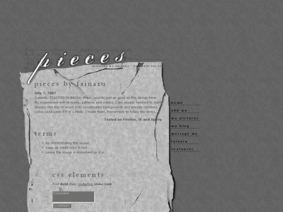
STACKED RUBBISH!
* Please report any pansies who happen to mess around with the design. Thanks! Also, don't know what happened with the copyright alignment. Pretend it isn't there.
layout archive > baretta.uni.cc
Using This Layout
For specific instructions read designer's comments
- This is a div overlay layout, html knowledge required!
- 1. Log into myspace.com
- 2. Click on Edit Profile (Profile 1.0)
- 3. Copy (ctrl c) and paste (ctrl v) code to the specified fields
Layout Comments
Showing latest 10 of 14 comments

i really like this layout, but i can't get ANY tables to show up (i want to put some of my content in a table within the div). do you know how that can be fixed?

Thank you all for your wonderful comments :D
@ marikris: I looked at my corner banner and I don't think anything is glitched, the hover works fine. What do you mean?
And you see half the add because the layout doesn't stretch that far. It's sized 760px.
I don't know why, but whenever I click the preview of the layout, there's a section on the top right corner by the corner banner "Designed by Fainaru" that is somehow glitched. I see the end section of the Myspace ads (part of "Powered by Google"). Is that just me?
I tried it on both Firefox and Internet Explorer and both are showing it.

lovelovelove!
I haven't dropped by here in forever and was browsing for a layout by one of the older (re: old school) designers and was about to give up when I found this.
As usual you don't disappiont; I really like the sophisticated aged look on this, it feels almost nostalgic but retain some sense of modernism. Not sure how you achieved that rather contradicting balance but certainly well done.
I think it would look better if you shifted the graphic up maybe a couple hundred pixels. And maybe if it didn't continue to end of page, but rather was a complete piece of paper, if that makes sense?
Good job though; deviates from your usual style, but most definitely your work.

This is really good =]

This is a wonderful Layout! I love it!

The colors look really limited, but the layout overall remains awesome. The header looks really cool, and I love the cracks on the box and stuff. The nav links obviously seem different from how you usually make them, but they don't look too bad. Nice job. :]

nav looks a bit weird and for some reason the myspace copyright shows up but it looks sooo pretty
nice man this layout is kool
Layout Details
| Designer |
fainaru
|
| Submitted on | Jul 7, 2007 |
| Page views | 48,396 |
| Favorites | 214 |
| Comments | 14 |
| Reviewer |
karmakiller
|
| Approved on | Jul 8, 2007 |