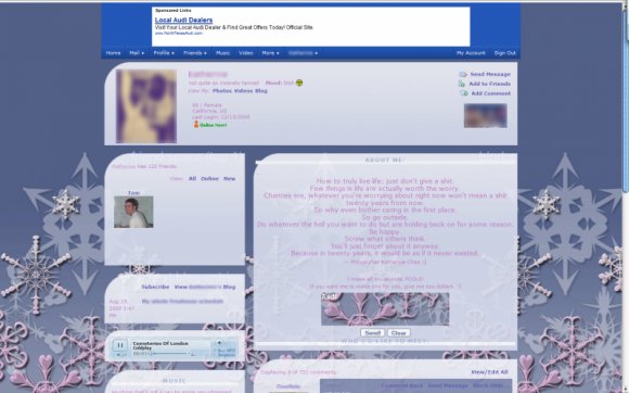
Designer's Comments
Look carefully for specific instructions
First layout submission. There's a lot of extra CSS that I added to make the CB preview look alright.
ALSO: To get rid of the ugly white borders on the top and bottom of the modules, go to Advanced Edit > Modules > Border & Padding > Size and change it to zero.
ALSO: To get rid of the ugly white borders on the top and bottom of the modules, go to Advanced Edit > Modules > Border & Padding > Size and change it to zero.
Using This Layout
For specific instructions read designer's comments
- 1. Log into myspace.com
- 2. Click on Edit Profile (Profile 2.0)
- 3. Copy (ctrl c) and paste (ctrl v) code to the specified fields
Layout Comments
Showing latest 9 of 9 comments

This is so beautiful!! I love it. I hope you make more.
By ahhxixcantxhearxyou on Dec 23, 2008 11:06 pm
how did u make it one photo?
By swtang3l on Dec 21, 2008 7:01 pm
uaing...!
By swtang3l on Dec 21, 2008 6:18 pm
Using this for the season! Thanks!
By SimplyEmi on Dec 18, 2008 1:35 am
cuteeeee. i'm using it :]
By x0melzie on Dec 17, 2008 7:11 pm
its not the best quality.
By SugaPwum on Dec 16, 2008 12:54 pm
I just used negative border radius (-moz-border-radius) in the CSS. :] and thanks
By turtle199 on Dec 15, 2008 7:21 pm
Oh wow... amazing! Very nice table structure idea! :D
How did you do that?!
By Weathered on Dec 15, 2008 2:16 pm
Layout Details
| Designer |
turtle199
|
| Submitted on | Dec 14, 2008 |
| Page views | 9,425 |
| Favorites | 34 |
| Comments | 9 |
| Reviewer |
manny-the-dino
|
| Approved on | Dec 15, 2008 |


