Designer's Comments
Look carefully for specific instructions
Read this before asking questions/commenting!
Comments containing excessively long links that were not renamed in the linking process will break the layout. Images and flash video placed in the comments will be resized properly. Images and videos placed in the interests sections will be resized properly also. Please, do not remove the credits.
The code for the custom online now icon can be found here. The generator for the banner can be located here.
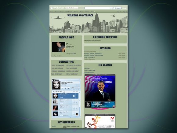
The background image on the screen shot is for aesthetic purposes only.The layout looks different in the preview, but once the code is input on MySpace it will look just like the screen shot depicts. The live preview is not 100% accurate, and there is nothing I can do about that.
Comments containing excessively long links that were not renamed in the linking process will break the layout. Images and flash video placed in the comments will be resized properly. Images and videos placed in the interests sections will be resized properly also. Please, do not remove the credits.
The code for the custom online now icon can be found here. The generator for the banner can be located here.
The background image on the screen shot is for aesthetic purposes only.
Using This Layout
For specific instructions read designer's comments
- 1. Log into myspace.com
- 2. Click on Edit Profile (Profile 1.0)
- 3. Copy (ctrl c) and paste (ctrl v) code to the specified fields
Layout Comments
Showing latest 8 of 8 comments

im using this on my myspace right now. I really like it. x3
By Mollylikesrocketships on Nov 21, 2009 2:18 am

pretty sweeeet :]
By aaayotiffany on Nov 13, 2008 6:10 pm

agreed. i cant view this properly. like it though
By ScriptedLove on Nov 9, 2008 1:37 am

Yeah I agree...Createblog need to update on the preview for all browsers. I like the layout.
By CruelDemeanor on Nov 8, 2008 8:10 pm

woot if it has the top banner on actually myspace then i will so use this ..
By diputs on Nov 8, 2008 1:02 pm
Createblogs preview needs to be updated. its been a while. lots of changes
By A9M0i0R on Nov 8, 2008 9:55 am

I'm pretty sure it looks different on a real myspace then the preview, of course. I really like this :D
By Harp on Nov 8, 2008 4:16 am

It's completely different looking than the preview.. the background is a solid green and there is no top banner.
But I still love it.
By dilligrout on Nov 8, 2008 3:15 am
Layout Details
| Designer |
itsmattadams
|
| Submitted on | Nov 8, 2008 |
| Page views | 24,671 |
| Favorites | 83 |
| Comments | 8 |
| Reviewer |
Relentless
|
| Approved on | Nov 8, 2008 |