Designer's Comments
Look carefully for specific instructions
please don't jock, redestribute, or take my credit off.
Using This Layout
For specific instructions read designer's comments
- 1. Log into myspace.com
- 2. Click on Edit Profile (Profile 1.0)
- 3. Copy (ctrl c) and paste (ctrl v) code to the specified fields
Layout Comments
Showing latest 7 of 7 comments

I'll try to restrain myself from jocking this.o.O

i think the background of the tables shouldnt perfectly match the background of the page. and and the font colors are exactly the same as the skull. didnt seem like there was too much thought put into it.

well i like it. simplicity is good.

couldve been better... sorry =/

It would be better if the default text color wasn't black so that you could actually read it... :-/

Yeah.... this is not very creative AT ALL... And not to be hateful, but I wouldn't jock this even if I was someone who did that.... I wouldn't want this on my credit.... I'm sorry. You just didn't put any effort into it. If you had, I wouldn't come off as being an asshole. And I'm sorry if you think I am being one, I don't intend, I'm just letting you know what my opinion is about the layout.

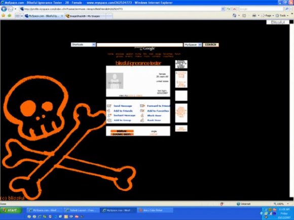
Eh. It's just an orange skull on a black background :-/
Layout Details
| Designer |
blissful-ignorance
|
| Submitted on | Oct 12, 2007 |
| Page views | 21,215 |
| Favorites | 63 |
| Comments | 7 |
| Reviewer |
Insurmountable
|
| Approved on | Oct 12, 2007 |