Designer's Comments
Look carefully for specific instructions
DO NOT REDISTRIBUTE
DO NOT JOCK/STEAL CODES
All forms of flash might not be moved to the top left corner , if it does please look for and remove the following code
Directions:
1. make sure that you replace all the XXXXXX with your friend id # (just the number) before you save the layout (all links become MSplinks once saved on myspace)
2. take into account that i made this layout for you... it doesn't mean that you can remove the credits or claim this as yours.
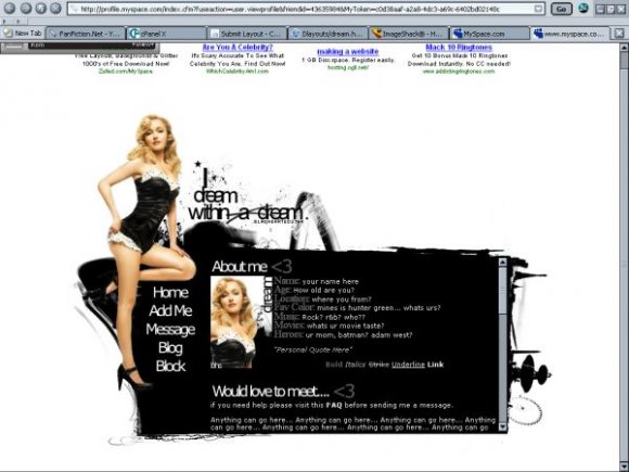
note: sorry about the quality of the chick... its a PNG from http://www.xoxmariah.com/ i tried to fix it to the best of my ability without making it look too bad... i wanted this to be a 2nd version of modern pin-ups (like my JLO layout)
Credit:
Model: Hayden Panettiere
Image PSD: http://www.xoxmariah.com/
Brushes: http://37pence.org/
http://www.rainharbour.net/
http://myrasis.livejournal.com/
Comment box: http://panicked.nuclearcentury.com/
Using This Layout
For specific instructions read designer's comments
- This is a div overlay layout, html knowledge required!
- 1. Log into myspace.com
- 2. Click on Edit Profile (Profile 1.0)
- 3. Copy (ctrl c) and paste (ctrl v) code to the specified fields
Layout Comments
Showing latest 10 of 16 comments

ahh I love this layout :]
I would kill for those legs :]

I love it :)

ohh its the heroes chick
i thought it was her
Rock on, Amanda's back making layouts yet (I haven't browsed through all the ones I missed in my like, month long absence so don't know if you've put something out already, so, sorry about that).
It's good to see stuff from you again. Creatively, this isn't as amazing as some of the other stuff you've done, but I really really like this.
The execution is just clean and crisp. And I like the set up a lot, the simple use of one image, to present the information clearly and to avoid cluttering. And I like the decoration around black, especially the almost smokey looking effect on the left, behind Hayden? Is that a brush? If so where is it from? If not, how did you achieve the effect?
I think generally, my favourite thing about this layout is the black ... box, for lack of a better word, the content is on. It's just really cool.

Absolutely love it!

Nice.

wait, nevermind, you didn't cut it
great rollovers.
like it lots.
you cut the image real well

Oh, I like this one. =]

I think the image of Hayden could have been higher quality but other than that it's good... the rollovers are very cool.
Layout Details
| Designer |
Blaqheartedstar
|
| Submitted on | Jul 12, 2007 |
| Page views | 25,266 |
| Favorites | 90 |
| Comments | 16 |
| Reviewer |
mzkandi
|
| Approved on | Jul 12, 2007 |