Designer's Comments
Look carefully for specific instructions
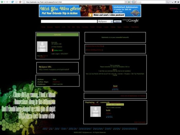
Using This Layout
For specific instructions read designer's comments
- 1. Log into myspace.com
- 2. Click on Edit Profile (Profile 1.0)
- 3. Copy (ctrl c) and paste (ctrl v) code to the specified fields
Layout Comments
Showing latest 6 of 6 comments

its cute

Interesting color choices. Not a huge fan but not bad..

The text is really difficult to read, and yeah, I agree with flah-ber-gast, when you click on a link, it gets bigger, and moves the normal text. (;

I somewhat agree with Mark, where is the "theme" in the layout?
Besides, the left module covers up half the text, and so it's not very readable even if they're popular lyrics.

i actually really like this. especially the colors. the only thing i didn't like was thwe links on hover. i dont like how they get bigger. maybe its just me :)

If you want my opinion, I don't really like this layout at all. :[ The background simply looks like a bunch of brushes slapped on each other with some text on it. I'm sorry.
Layout Details
| Designer |
iamsam1103
|
| Submitted on | Jun 6, 2007 |
| Page views | 38,153 |
| Favorites | 63 |
| Comments | 6 |
| Reviewer |
alovesopure
|
| Approved on | Jun 6, 2007 |