Designer's Comments
Look carefully for specific instructions
If you use it, please add me as a friend! I'd love to see it in action.
Using This Layout
For specific instructions read designer's comments
- 1. Log into myspace.com
- 2. Click on Edit Profile (Profile 1.0)
- 3. Copy (ctrl c) and paste (ctrl v) code to the specified fields
Layout Comments
Showing latest 10 of 13 comments

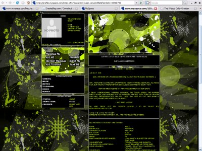
the backgrounds not it like shown in the screeny? :s
i like the coloring in this layout...

Hmm, its okay I suppose. I don't really like the background image. Since its supposed to be a pattern repeating, I think you could have made it so it wouldn't have a big space in between the images connecting.Its alright, next time perhaps use som

the coding difference, is that CB is a website using Myspace page codes, and myspace... is well myspace lolanyway great layout
QUOTE(blaqheartedstar @ Feb 4 2007, 5:01 PM) [snapback]2444294[/snapback]the contact table links are off by alot on some of themThe contact tables aren't off on the real myspace... only on the createblog preview. ;)(I'm assuming there'

QUOTE(flaymzofice @ Feb 4 2007, 7:00 PM) [snapback]2444398[/snapback]Complete chaos. That's what I call ordered anarchy. And I kind of like it. Great use of brushes and like Amanda said, that's a bad ass lime green.
Complete chaos. That's what I call ordered anarchy. And I kind of like it. Great use of brushes and like Amanda said, that's a bad ass lime green.

Nice layout. But I thought layouts like these aren't acceptable anymore in CB .. ?
the contact table links are off by alot on some of themand yellow turned to a bad ass lime green, anyway i like the background and brushes used for the layout which is pretty cool a different font would of been better but its your layoutgood job

oooh! veryy messy in a good way!!