The Used |
Resource Center Links
This Month's Contests | Hosts Looking for Hostees | Hostees looking for Hosts | BigBookofResources
Submission Guidelines
  |

 Feb 21 2005, 06:57 PM Feb 21 2005, 06:57 PM
Post
#1
|
|
 faggot  Group: Member Posts: 333 Joined: Jan 2005 Member No: 92,328 |
Well yeah I HAD to make a new layout.
Bastards. Just Tell Me What You Think. Link In Sig. |
|
|
|


|
Feb 21 2005, 07:19 PM
Post
#2
|
|
 boa loyal fans 4eva!!!! Group: Member Posts: 533 Joined: Feb 2005 Member No: 100,738 |
very nice!!!!!
9.5/10 missing the .5 because now and day so many do the messy brush strokes style. well keep up good work! |
|
|
|
|
Feb 21 2005, 08:23 PM
Post
#3
|
|
|
Senior Member Group: Member Posts: 254 Joined: Jan 2005 Member No: 91,811 |
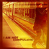
I love the image though the scratchy messy look is overused nowadays.
Some blending is weird though, like his head to his shirt. I like those things above where it says blog and info, though it seems kinda pixelly. There's some stuff plain, like headers and dates. And the red for text seems a bit too dark and the white seems too bright. 9/10 |
|
|
|
|
Feb 21 2005, 09:46 PM
Post
#4
|
|
 A.K.A. Simplicityxx Group: Member Posts: 1,878 Joined: Oct 2004 Member No: 56,813 |
ooooh, thats hot.
 I think Quinn Allman is a cutie. I think Quinn Allman is a cutie.  But i love your layout. Always wanted to do this messy kind of header like yours (sorry cant really explain it) but I am no good. But i love your layout. Always wanted to do this messy kind of header like yours (sorry cant really explain it) but I am no good.
|
|
|
|
| *StanleyThePanda* |
Feb 21 2005, 10:30 PM
Post
#5
|
|
Guest |
ooh th used!
haha nice. its pretty cool. the colors are kind of.....overused and so are the splatted brushes but I still like it |
|
|
|
|
Feb 21 2005, 10:33 PM
Post
#6
|
|
|
faggot Group: Member Posts: 333 Joined: Jan 2005 Member No: 92,328 |
QUOTE(BOAmusics @ Feb 21 2005, 6:19 PM) very nice!!!!! 9.5/10 missing the .5 because now and day so many do the messy brush strokes style. well keep up good work!  QUOTE(sociallydsoryntd @ Feb 21 2005, 7:23 PM) I love the image though the scratchy messy look is overused nowadays. Some blending is weird though, like his head to his shirt. I like those things above where it says blog and info, though it seems kinda pixelly. There's some stuff plain, like headers and dates. And the red for text seems a bit too dark and the white seems too bright. 9/10 QUOTE(simplicityxx @ Feb 21 2005, 8:46 PM) ooooh, thats hot. I think Quinn Allman is a cutie. But i love your layout. Always wanted to do this messy kind of header like yours (sorry cant really explain it) but I am no good.QUOTE(StanleyThePanda @ Feb 21 2005, 9:30 PM) ooh th used! haha nice. its pretty cool. the colors are kind of.....overused and so are the splatted brushes but I still like it You people are hard to please!!! No offense but if I were to just kind make a banner with the images and put it at the top it would be to plain... but if I use brushes they are overused.  Thanks for the compliments tho. |
|
|
|
|
Feb 22 2005, 06:34 PM
Post
#7
|
|
|
questions make me blue. Group: Member Posts: 2,608 Joined: Feb 2004 Member No: 3,796 |
nice. that looks awesome! good job!

|
|
|
|
|
Feb 23 2005, 06:19 PM
Post
#8
|
|
 mosh. Group: Member Posts: 1,841 Joined: Dec 2004 Member No: 73,114 |
its okay... 8/10
|
|
|
|
|
Feb 23 2005, 09:01 PM
Post
#9
|
|
 ♥ Group: Official Member Posts: 4,066 Joined: May 2004 Member No: 18,393 |
I like it!!
Good job bud.
|
|
|
|

|
Feb 24 2005, 12:50 AM
Post
#10
|
|
 oh sweet pestilence Group: Member Posts: 2,251 Joined: Jun 2004 Member No: 22,876 |
The Used! Yay! I really like it!!! Awesome job
|
|
|
|
|
Feb 24 2005, 01:29 AM
Post
#11
|
|
|
faggot Group: Member Posts: 333 Joined: Jan 2005 Member No: 92,328 |
QUOTE(D1SMANTLED @ Feb 23 2005, 5:19 PM) its okay... 8/10 I know I wish I could be as good at it as you. (not being a smartass) QUOTE(xoxo_koala_kisses_ @ Feb 23 2005, 8:01 PM) I like it!! Good job bud. Thanks. QUOTE(RandomHero @ Feb 23 2005, 11:50 PM) The Used! Yay! I really like it!!! Awesome job I think I might add it to the skins section. |
|
|
|
|
Feb 24 2005, 01:49 AM
Post
#12
|
|
|
Member Group: Member Posts: 11 Joined: Aug 2004 Member No: 42,718 |
dude i love the used! great job....u should make this available to the public...why is nobody doing that anymore?? the number of available new skins is dwindling
|
|
|
|
|
Feb 24 2005, 02:51 AM
Post
#13
|
|
 Senior Member Group: Member Posts: 130 Joined: Oct 2004 Member No: 55,559 |
I really like this layout, the design is very new. The only thing I have to pick at is your font color for your blog entries (the dark red) and the border around your dates, which in my opinion, looks kind of bad... But other than that, I really like it!
|
|
|
|
|
1 User(s) are reading this topic (1 Guests and 0 Anonymous Users)
0 Members: