Tutorial
Click on thumbnailed images to enlarge
Autumn Color icon tutorial
Note: I use Photoshop CS. I know that this will work in 7, but, I doubt it'll work in any other programs due to the usage of the selective color feature.

Now, on with the fun!
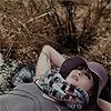
1. Grab your base.
2. Duplicate your base and set it to Screen @ 60%
3. Create a new layer, flood fill with FEEED6 and set it to Multiply @ 100%
4. Create another new layer, fill it with 130D31 and set it to Exclusion @ 100%
5. Okay, now, we're going to do some a selective color layer, so go Layer >>New Adjustment Layer Selective Color and here are your settings:
Reds:
Cyan: -100
Magenta: +29
Yellow: +100
Black: +100
Yellows
Cyan: -100
Magenta: +53
Yellow: +100
Black: +13
Neutrals
Cyan: 7
Magenta: -3
Yellow: +25
Black: -20
Now, you should have a much more vibrant picture, as compared to the base in the beginning.
6. 'member that base? Duplicate it and drag it up to the top. Set it to Soft Light @100% . A bit more vibrant, eh?
7. Now I added some text/decorations. I created a new layer, and took a white soft edges brush and did that soft white thingie, and then I put some text over it. Voila!
Note: I use Photoshop CS. I know that this will work in 7, but, I doubt it'll work in any other programs due to the usage of the selective color feature.
Now, on with the fun!
1. Grab your base.
2. Duplicate your base and set it to Screen @ 60%
3. Create a new layer, flood fill with FEEED6 and set it to Multiply @ 100%
4. Create another new layer, fill it with 130D31 and set it to Exclusion @ 100%
5. Okay, now, we're going to do some a selective color layer, so go Layer >>New Adjustment Layer Selective Color and here are your settings:
Reds:
Cyan: -100
Magenta: +29
Yellow: +100
Black: +100
Yellows
Cyan: -100
Magenta: +53
Yellow: +100
Black: +13
Neutrals
Cyan: 7
Magenta: -3
Yellow: +25
Black: -20
Now, you should have a much more vibrant picture, as compared to the base in the beginning.
6. 'member that base? Duplicate it and drag it up to the top. Set it to Soft Light @100% . A bit more vibrant, eh?
7. Now I added some text/decorations. I created a new layer, and took a white soft edges brush and did that soft white thingie, and then I put some text over it. Voila!
Tutorial Comments
Showing latest 5 of 5 comments

nice =]
By N4th4li3L on Apr 4, 2008 9:27 pm

thanks i really wanted to know this stuff. but could you maybe make it a little more graphic?? haha took me awhile to understand this.
By ninethedog on Mar 12, 2008 7:55 am
omgomgomg.i'm so going to use that for my fall layout.
By demolished on Aug 7, 2006 5:37 pm

Knew I was forgetting something. Sorry.
By technicolour on Aug 7, 2006 1:02 pm
what's the difference ?i want to see "before" and "after" pix.pleasee ;]
By demolished on Aug 7, 2006 2:53 am
Tutorial Details
| Author |
technicolour
|
| Submitted on | Aug 6, 2006 |
| Page views | 30,223 |
| Favorites | 85 |
| Comments | 5 |