Designer's Comments
Look carefully for specific instructions
It was inspired by a recent desire to update my personal myspace and I also felt the need to share.
As always, comments are appreciated if you use.
Hope ya like it xD
Note: The Who I'd Like to Meet Section has been edited to fix the comment box code so that it now has a submit button and the box isn't full of code. Thank you to CrotchetTheLeper for pointing it out.
UPDATE: The layout is now resolution friendly and also shows the ad. Please let me know if you experience any other problems.
The CB previewer is messed up. For a better preview click here
Using This Layout
For specific instructions read designer's comments
- This is a div overlay layout, html knowledge required!
- 1. Log into myspace.com
- 2. Click on Edit Profile (Profile 1.0)
- 3. Copy (ctrl c) and paste (ctrl v) code to the specified fields
Layout Comments
Showing latest 10 of 11 comments

FUCK!!! I wish it would scroll, and the music player won't work!

I wish it would scroll, and the music player won't work with it, but otherwise I love it.

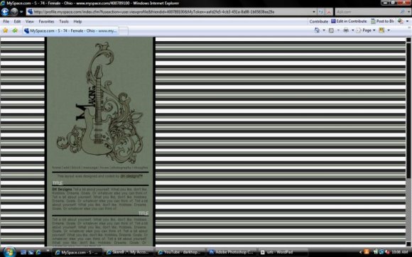
you did i great job on the guitar but i like the stripes alone
no offense its just me
I like the banner.

BOLD IS GOOD! MUSIC AND LOVE GOES TOGETHER THANKS :)

Wow. Very nice job. i really like the Guitar design. i wish i was that creative =P

Something's up with the comment box in the preview. It's full of code and there's no submit button. ;D
If I were you, I'd change the background of the comment box as well. It makes the text difficult to read.
Perhaps just make it a simple white-text on a black-background box.
Other than that, this is absolutley flawless. I must say this is one of my alltime favorites! :D

im having trouble i dont have enough space to write
it runs out, and just looks like a mess can u help? please!!
i like it. the striped are a little too much though

I love this. But I agree, the striped bg is a little too bold.
Layout Details
| Designer |
xDarkHope
|
| Submitted on | Jul 30, 2008 |
| Page views | 11,509 |
| Favorites | 91 |
| Comments | 11 |
| Reviewer |
manny-the-dino
|
| Approved on | Jul 31, 2008 |