Designer's Comments
Look carefully for specific instructions
Profile best viewed in FireFox on 1280 x 1024 screen resolution.
This is an advanced layout. Do not alter unless you know what you are doing.
Do not remove bottom credits.
Visit my website for over 60 FREE div overlays for myspace. Custom also available.
www.emarielayouts.com or email eMarie2470@gmail.com
NOTE:The CB codes for preview are outdated. You WILL NOT see anything left over from the default myspace page. Everything will be cleared. All my layouts
are tested in an actual myspace layout for best fit.
Using This Layout
For specific instructions read designer's comments
- This is a div overlay layout, html knowledge required!
- 1. Log into myspace.com
- 2. Click on Edit Profile (Profile 1.0)
- 3. Copy (ctrl c) and paste (ctrl v) code to the specified fields
Layout Comments
Showing latest 10 of 12 comments

woah, this is amazing. i love megan. using. (:

very sexy.
i choose this for my boyfriends myspace page a ong while ago.
he enjoyed it very much till i had found something else I wasn't too fond of. but all is put aside since his apology. He no longer has this page anymore but i'm sure he will use it again in the near future.

This thing is nifty!

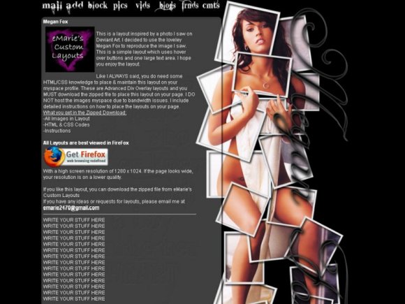
this effect is kewl. il ike it. i just dont like the actually pic cuz im not into chicks but yeah still kewl lol

That picture is just too cruel. D:

nicee
i like the effect on the image
its cool

i agree w/ rjohnson i like image effect, it looks like she's holding herself together.
kudos!

I almost didn't notice it, but the gray text area has one of her tattoos embossed in it. I like that. It makes it more... personal? I dunno what word I'm looking for.
Anyway, nice effects with the image. It looks like you spent a lot of time on it, which is key. Maybe choose a different font with the navigation. It looks a little rough against such a beautiful girl.
Hope to see more of your work soon. C:

The effect is really neat. I like how her finger is curling over one of the framses!

Interesting effect with the image.
Layout Details
| Designer |
eMarie2470
|
| Submitted on | Sep 20, 2008 |
| Page views | 28,775 |
| Favorites | 74 |
| Comments | 12 |
| Reviewer |
schizo
|
| Approved on | Sep 20, 2008 |