Designer's Comments
Look carefully for specific instructions
If you add another module on the left the blog will move up. Please fix the margin-top at the bottom of the code to a smaller number.
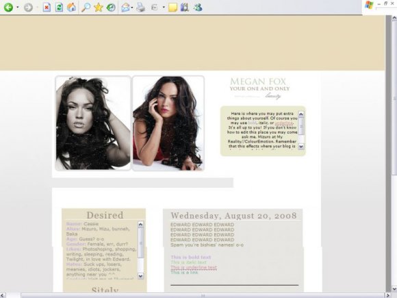
It's misaligned on CB preview. The blog moves up and the ad thing is there. Please view it here.
This was made by me.
Hope you like it =]
- - Mizuro
It's misaligned on CB preview. The blog moves up and the ad thing is there. Please view it here.
This was made by me.
Hope you like it =]
- - Mizuro
Using This Layout
For specific instructions read designer's comments
- 1. Disable Xanga themes (edit theme -> uncheck make this your active theme -> save)
- 2. Log into xanga.com (look & feel)
- 3. Copy (ctrl c) and paste (ctrl v) code to the specified fields
Layout Comments
Showing latest 4 of 4 comments

sorry, derr didnt read the designers comments :P
By hiimeka on Aug 21, 2008 3:27 pm
kind of looks like the banner needs some more. and also not aligned right in my IE.
By hiimeka on Aug 21, 2008 3:26 pm

Yeah, I agree about the scratches.
Would've looked way better without them.
If I had a xanga, I'd totally use it since it's awesome and I love Megs. :D
By so-sarcastic on Aug 21, 2008 9:25 am

I love it.. but I dont like the scratches at all. I think it would look way nicer without them. Other than that, Its beautiful.
By dosomethin888 on Aug 20, 2008 11:57 pm