Designer's Comments
Look carefully for specific instructions
NOTE:
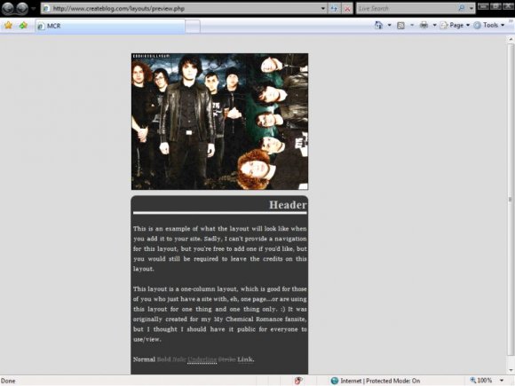
This layout only includes one column, no navigation. I tried to come up with different styles of navigation that would look good, but they all turned out...ew. I even tried the navigation I use on my MCR fansite, but I thought that looked ugly as well.
I can't honestly say which browsers this layout looks best on, but I can guarantee you that it looks PERFECT in IE7. Feel free to inform me if there are any other browsers that this layout looks good on.
EDIT: I added a bottom padding. Thanks to IzzyGrace for pointing that out.
Layout Comments
Showing latest 6 of 6 comments

I love how simple it is. I wish it was a bit wider, but other than that I think it's fantastic. (and yummy. ;D)
By kathleenyellowx on Apr 13, 2009 5:08 pm

o0o0o love it!
By StandardEdition on Jun 4, 2008 2:29 pm

Simple and nice. :)
By dreamgurl36 on Jun 4, 2008 11:38 am

I like the simplicity. :)
By schizo on Jun 4, 2008 11:12 am

Love it. ♥
By futura on Jun 4, 2008 1:41 am

Very nice. I heart MCR.
It looks fine in Firefox, as well. The only thing is that the page ends right where the box does, and that's just a pte peeve of mine. I'd suggest perhaps a 25-30px padding on the bottom :)
By IzzyGrace on Jun 4, 2008 1:03 am
Layout Details
| Designer |
cookiexsillysum
|
| Submitted on | Jun 3, 2008 |
| Page views | 3,917 |
| Favorites | 8 |
| Comments | 6 |
| Reviewer |
kreios
|
| Approved on | Jun 4, 2008 |