Designer's Comments
Look carefully for specific instructions
OR EDIT AS YOUR OWN
Basic HTML knowledge is needed to work this layout to your liking.
Replace all XXXXXX with your friend id.
Also there is no code to hide any flash players... so make sure you do not have the myspace mp3 player on your profile.
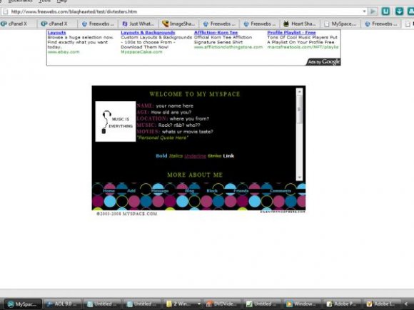
Its a very simple layout, my first in a very long time... so ehh... enjoy.
All forms of flash might not be moved to the top left corner , if it does please look for and remove the following code
Credits
Made in Photoshop
*comment box has been updated*
Using This Layout
For specific instructions read designer's comments
- This is a div overlay layout, html knowledge required!
- 1. Log into myspace.com
- 2. Click on Edit Profile (Profile 1.0)
- 3. Copy (ctrl c) and paste (ctrl v) code to the specified fields
Layout Comments
Showing latest 8 of 8 comments

can someone tell me where to hide the music player?
i got the new version.
or you can just use a normal code ?

I really like it, and I'm using it now, but the original nav (Home, browse, etc) shows up behind the layout. :|

Where is the spot that I can put my own picture in?

I can´t find the "XXXXX" for my ID friend :S can you help me please? Thanks, pretty layout

so cut3

very nice. great job. I'm hating the black on white though.. I think you should make the background a grayish or something.. try #141414?

It's been so long since I've seen a layout from you.

this actually isn't that bad. you might wanna incrase the height for the navigation because it's kinda confusing since the words are so close the the dots. the only thing that bothers me are the colors you chose. they don't complement each other. keep blue and pick one other bright color. love the simplicity and the structure of it. nice job.
Layout Details
| Designer |
Blaqheartedstar
|
| Submitted on | Mar 19, 2008 |
| Page views | 21,361 |
| Favorites | 133 |
| Comments | 8 |
| Reviewer |
karmakiller
|
| Approved on | Mar 20, 2008 |