gonna post some of my tumblr posts on here i think
DESIGN DISCUSSIONS: PAUL SHAW & THE NYC SUBWAY
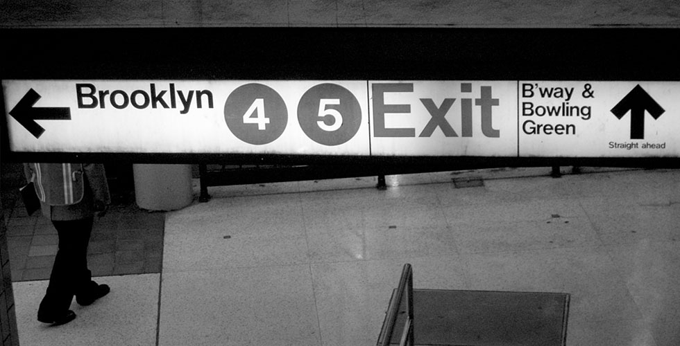
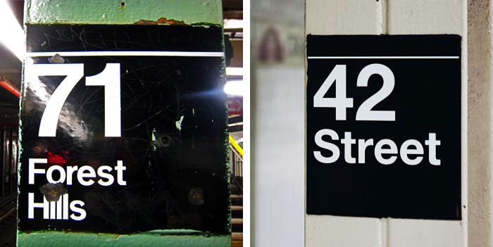
this is a really good read for anyone interested in typefaces or design in general. its an interview with paul shaw who wrote Helvetica and the New York Subway System: The True (Maybe) Story. which is basically about the history/mystery of the nyc subway typography. the mystery is basically that no one really knows why the NYC transit chose standard instead of helvetica for their signage back in 1966 and 1970. massimo vignelli designed all that, but he doesnt remember why standard was chosen either instead of helvetica, which people also find weird because vignelli used helvetica elsewhere.
good read and you will be more knowledgeable than the 90% who think that nyc subway signage system has always been in helvetica. if you dont believe it then check the pictures in the post, take a look at that e. dead give away.