I see the ad was moved above the nav, im guessing to avoid the problem with the ad covering it. But it is very ugly now...
I bet it will get more clicks now though cause ill click on it, on accident a lot.
Do you guys like it?
Full Version: New ad positiioning?
Wow now everything is messed up?! The nav is invisible!

I know, but it should be fixed either way.
hi guys,
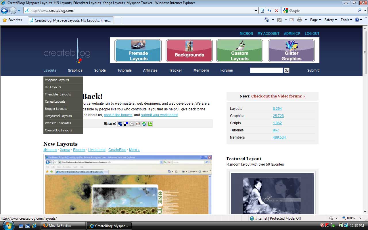
try refreshing the page, it shouldnt look like the screenshot above. the new ad placement is to address an issue with some browsers where the drop down menu appear behind the ad.
try refreshing the page, it shouldnt look like the screenshot above. the new ad placement is to address an issue with some browsers where the drop down menu appear behind the ad.
QUOTE(divergent @ Apr 15 2009, 04:17 PM) 
Once I refreshed in firefox, the navigation showed up as normal. :)
Did you notice also, the logo on the non-forums pages is like 30% larger.
Did you notice also, the logo on the non-forums pages is like 30% larger.
Oh yeah, I noticed that too. Wierd.

This is only on the non-forum side of cB, right?
I think it's okay. I mean it's not that big of a deal. Just need to get it used to looking differently.
I think it's okay. I mean it's not that big of a deal. Just need to get it used to looking differently.
Oh yeah, and the gradient is bigger and a bit of a different color on non-forums pages.
yeah the createblog logo doesn't fit on the forum page now for me, it's mostly covered up. it's also a different color blue than the entire bar.
i didn't even notice the ad moving at until i saw this topic.
i didn't even notice the ad moving at until i saw this topic.
Its kinda odd but any time I see something weird, I just hit refresh and it fixes it. It doesnt even fix it if I leave and come back. Only when I refresh.
well for me the ad bar is in the way when i try nav on cb
This is a "lo-fi" version of our main content. To view the full version with more information, formatting and images, please click here.