I didn't want to post this until I was finished, but damn I am just so bored.
At the time I started this I was set out to make a back and white layout. Every thing is going to have a roll over. My pc will rollover to color, the three dots in the right hand corner will link home and glow red so one so fourth.
C&C please?
Edit
A few changes, plus I thought I'd see what it looks like with color. I think I like it better white.
Blue version: here
EDIT:
live preview
SV and CB links have rollovers, so do the links above them. Comments done too.
Haven't seen it in IE yet.
Full Version: myspace 3.0


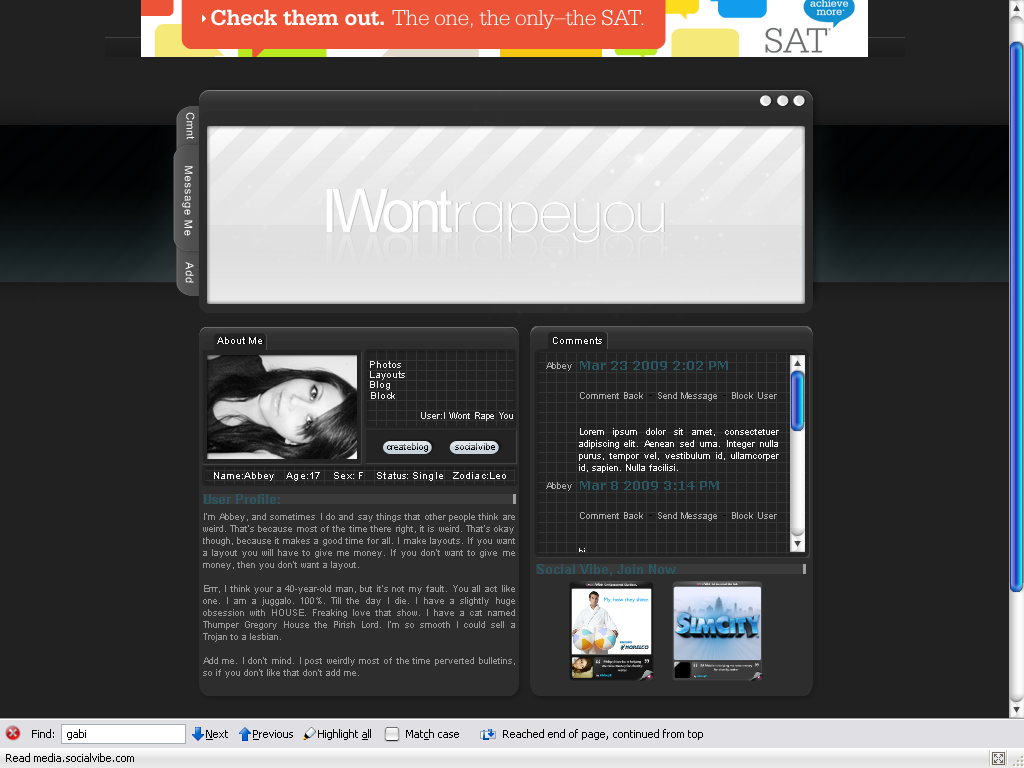
I like it, kinda has a mac UI feel to it. Cause the three dots in the top right hand corner. the only thing that I don't feel is the banner above the space. Everything else is cool. I like the tabs.
When did myspace 3.0 come around?
I like the layout. I can read the text iwontrapeyou that well though.
I like the layout. I can read the text iwontrapeyou that well though.
It's just what I call the layout.
Oooh I like it. I'm partial to gray designs, so I can't wait to see the finished product.
There isn't a shadow on the bottom left box. Or if there is..it isn't all that noticeable. Sorry, it's one thing I look for. I'm a dork.  But, other than that, I think that this is pretty dang awesome.
But, other than that, I think that this is pretty dang awesome.
^There is, it's just at a different angle. I'll have to fix it.
Thanks guys!
Thanks guys!
Oooh, me like. It's really professional. :)
Ohh I really like it. I think with the rollovers it will look even better. Nice job. :)
^Thank guys, The only rollovers I haven't worked out yet are the ones on the tab. I can't make them pull out so I don't what to do with them.
That's hot. I prefer the edited version, though. It looks better to me with a hint of color. (:
I actually like that. Nice work. 
Wait which rollovers are supposed to be working? /slow
I say go with the gray or blue one.
I say go with the gray or blue one.
lol none of them now, I just coded them comments, background ect. I am moving sloooooow.
i love the clean, dark look (: gj ;D
^Thank you.
Ooohh, I like this a lot. I like the blue one the best. Nice job.
This is a "lo-fi" version of our main content. To view the full version with more information, formatting and images, please click here.