Help - Search - Members - Calendar
Full Version: Just Screwing Around
Forums > Resource Center > Showcase Booth
awakeaftermidnight
I was playing with different effects and crap. yeah, so this is what the results were.

good, bad?


anything else I should add, take off, do...
etcetcetc.


click images for fullsize por favor.


brooklyneast05
i like these better than some of ur previous ones, i still wish they were...clearer? or something
Tung
too repetitive and too plain. not much exciting going on.
SinfullySweet
I agree with JCCCCC and tung.

I think they are kind of plain.

But again. This is a really big issue for me with your graphics. When you find some new type of style, eg. effects, looks, you tend to stick to them exactly, use them on different images, which makes your images seem extremely plain. You should try using your new found love of style and technique in 
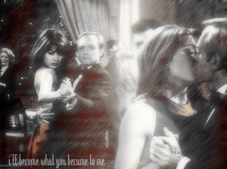
different ways. For example, on all your images, there seems to be a huge lowered opacty of light in the middle.

Instead of using that same exact placement and techniqe exactly the same on every graphic, try chaing the poistion, the view, and the size, the color.

Do you understand what I mean?

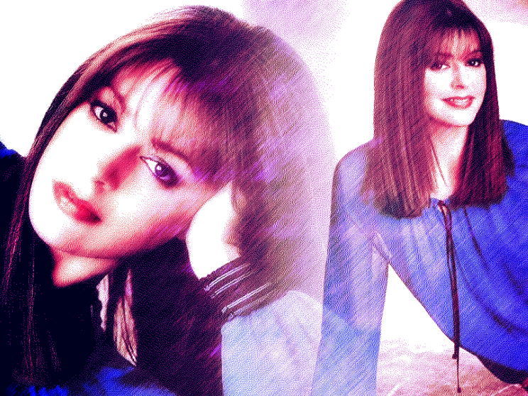
One last thing. The filters - Please, dont abuse them. They may seem to look nice, but you are kind of overdoing it with them. Some filters are nice on some images, and some are not.

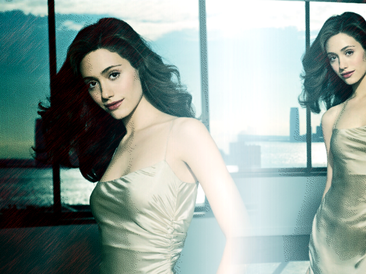
http://i188.photobucket.com/albums/z30/caf...s/janeart1a.png

The filter applied on that image makes it looks grainy.

imo, you should only use filters when wanting to distort sorts of blemishes, or ugly unwated things, such as pimples on the skin, and using some sort of method (such as layer masks) and not making look like you used a filter.

I'm not saying this to be rude, this is just my up-most constructive criticistic opinion :)

Work at, and you'll get much better.

Also, have you ever considered switching to photoshop?

Let me give a shot at it, and try to explain it to you with an example :)
ipetpandas
I agree with everyone else. :X

What you're doing is pretty much the same thing over and over... which is very boring.
Tung
QUOTE(SinfullySweet @ Oct 7 2007, 05:13 PM) *
I agree with Alvin and tung.


LMAO thats not Alvin, thats JC.
HAHAHAHAHAHAH
brooklyneast05
i take that as an extreme insult...
technicolour
Ouch. Poor JC. laugh.gif


But, about the graphics, I agree with everyone else. Spice it up! Add some new textures that'll add some different colors. Try reversing the images around and playing with placement. Try some brushes, but not too much.
SinfullySweet
I'm sorry JC!!!!! I love you!! throb.gif

I was just finished reading the moderator changes when I posted :(
brooklyneast05
i forgive u, i forgive u
Relentless
I do agree what everyone had said, and they look the same. Don't over-ly filter them, making them look awkward and such. Try adding textures, brushes, etc?

The noise/scatter/grainy thing makes it look ugly IMO.
IVIike
nice job i really like these thumbsup.gif
Tung
QUOTE(IVIike @ Oct 9 2007, 05:17 PM) *
nice job i really like these thumbsup.gif


mike, this is the first time i disagree with you.
digitalfragrance
Well I think that the diffusion effect that you used makes the images lower quality-looking. However, the colors are fine.

Ditto pretty much everyone else. No need to repeat that.
This is a "lo-fi" version of our main content. To view the full version with more information, formatting and images, please click here.