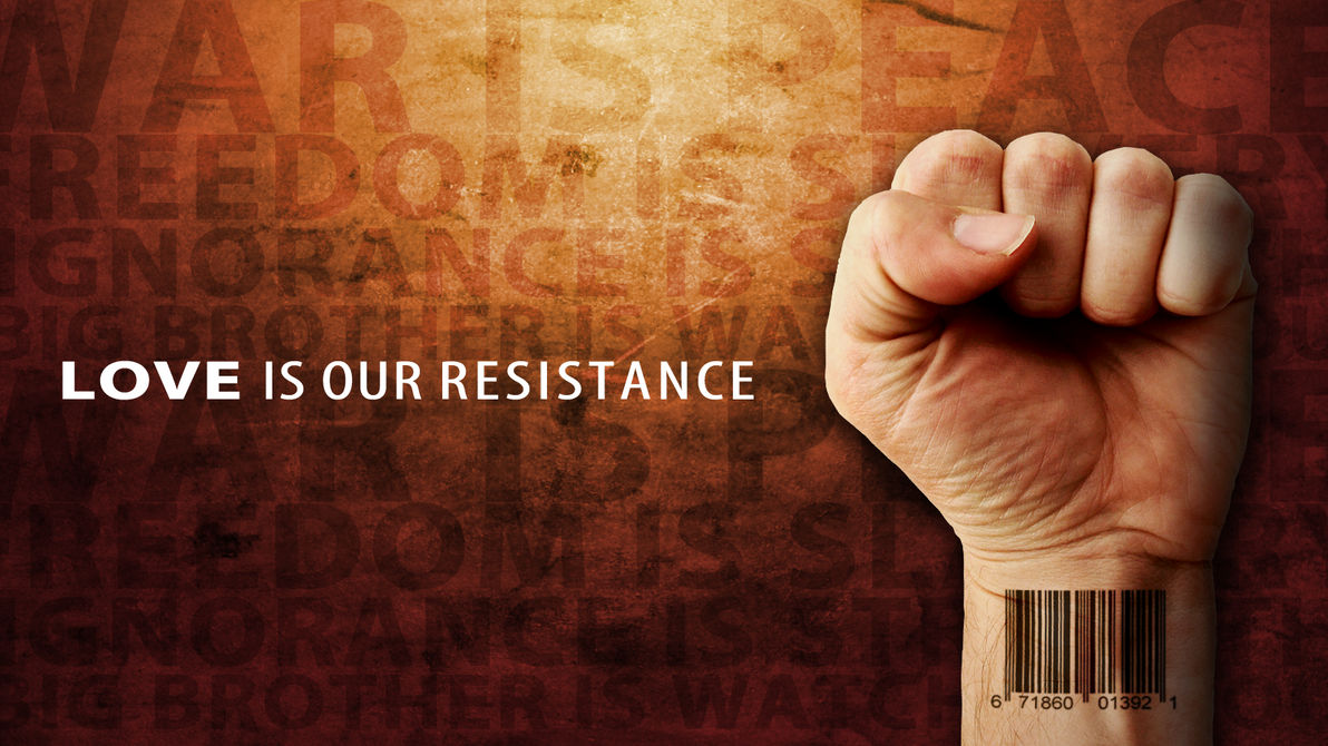
LOVE is our resistance (please view) |
Resource Center Links
This Month's Contests | Hosts Looking for Hostees | Hostees looking for Hosts | BigBookofResources
Submission Guidelines
  |

 May 20 2010, 03:58 PM May 20 2010, 03:58 PM
Post
#1
|
|
 LOVE is our resistance  Group: Member Posts: 157 Joined: Aug 2007 Member No: 556,214 |
this was heavily inspired by muse's song "resistance" and from reading 1984 by george orwell.
please tell me what you guys think!
Reason for edit: Please use [thumb][/thumb] for large images! -Jiyong (Gabrielle).
|
|
|
|


|
May 20 2010, 04:01 PM
Post
#2
|
|
 Group: Staff Alumni Posts: 7,019 Joined: May 2008 Member No: 653,768 |
<3 that song
|
|
|
|


|
May 20 2010, 05:06 PM
Post
#3
|
|
 show me a garden thats bursting to life Group: Staff Alumni Posts: 12,303 Joined: Mar 2005 Member No: 115,987 |
Search around for a way to make that barcode look like it was tattooed on the wrist and I'd say that this is pretty legit. You should try a vectored version. I think this concept, with a few tweeks, would look pretty legit vectored.
|
|
|
|


|
May 20 2010, 05:47 PM
Post
#4
|
|
 I'm Jc Group: Mentor Posts: 13,619 Joined: Jul 2006 Member No: 437,556 |
yeah if the barcode looked less flat it'd be better. i agree about the vectoring. concept is cooler than execution on this
|
|
|
|

|
May 20 2010, 05:56 PM
Post
#5
|
|
|
LOVE is our resistance Group: Member Posts: 157 Joined: Aug 2007 Member No: 556,214 |
QUOTE(technicolour @ May 20 2010, 06:06 PM)  Search around for a way to make that barcode look like it was tattooed on the wrist and I'd say that this is pretty legit. You should try a vectored version. I think this concept, with a few tweeks, would look pretty legit vectored. believe it or not i did mess with displace in photoshop to get a more "natural" feel. it looked awkward when it was on higher settings. |
|
|
|
|
May 21 2010, 08:11 AM
Post
#6
|
|
|
Group: Staff Alumni Posts: 7,019 Joined: May 2008 Member No: 653,768 |
I
DON'T BELIEVE IT |
|
|
|
|
May 21 2010, 12:57 PM
Post
#7
|
|
 Sex, Blood, & RocknRoll Group: People Staff Posts: 5,305 Joined: Nov 2007 Member No: 596,480 |
I think if it were smaller, moved over to the right just a little then made it to were the bar code lines weren't so sharp it would be fine. Agreed it would make a bomb vector.
|
|
|
|

|
May 21 2010, 01:30 PM
Post
#8
|
|
|
Group: Staff Alumni Posts: 7,019 Joined: May 2008 Member No: 653,768 |
heh you think if it were smaller
|
|
|
|
|
May 22 2010, 12:15 AM
Post
#9
|
|
 Senior Member Group: Administrator Posts: 8,629 Joined: Jan 2007 Member No: 498,468 |
Other than what everyone said about the barcode, it looks really cool. Great job

|
|
|
|

|
May 22 2010, 11:35 PM
Post
#10
|
|
 Mel Blanc was allergic to carrots. Group: Official Designer Posts: 6,371 Joined: Aug 2008 Member No: 676,291 |
Looks pretty cool. I'm not sure what the content really stands for, though. Or what that barcode is supposed to represent. Is it supposed to be like the fist (power of love) being restricted by the barcode (resistance)?
 Eh. I like the graphic, but I can't really understand the underlying concept of it. Also, that nail is really bothering for some reason. EDIT: Forget what I said about not understanding the concept. I missed that you said it was inspired (or well, partially inspired) by 1984. |
|
|
|

|
1 User(s) are reading this topic (1 Guests and 0 Anonymous Users)
0 Members: