design competition round 3 results |
Rating


|
Resource Center Links
This Month's Contests | Hosts Looking for Hostees | Hostees looking for Hosts | BigBookofResources
Submission Guidelines
 Jun 24 2009, 12:13 AM Jun 24 2009, 12:13 AM
Post
#1
|
|
 I'm Jc  Group: Mentor Posts: 13,619 Joined: Jul 2006 Member No: 437,556 |
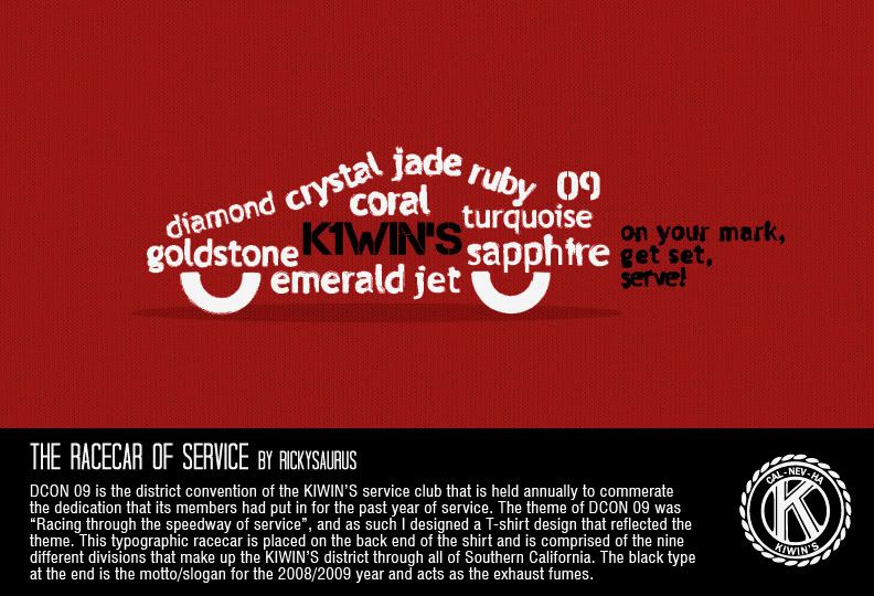
ROUND 4 WILL BE ANNOUNCED SOON more people expressed interest in this round than actually participated...  Ricky: congrats on taking first place ricky. the judges really liked what you did. although yours was simple, it was the smaller details that won the judges over. it was very clean. everyone liked the coloring. your shape reads as a car easily. i think the best part of your design was your use of differing font sizes to create the curves and shape needed. this refined it in general. the biggest complain was the grungy effect on the edges of the letters. Zachy: yours was a close second place. the judges really liked this one too. i really like the font, so much that i want to see more of it. the letters are so overlapped that the nice shape of the font kinda of disappears. i just wish it was less text and more readable. also there are some alignment issues, especially on the left side of the bottle that i would have liked to see straightened up more. however, we think you did pretty good overall with the shape of the bottle. it's hard to work with a curved shape like that. the judges weren't a huge fan of the black text shadow and didn't think it read well as a shadow. everyone really liked the coloring and lighting. you did a really nice job incorporating the lighting into it. i think it really helps it look less flat. Joseph: i duno about this man. when i saw it, i really liked it. then i looked closer and realized it wasn't really what i thought it was. where everyone else had to work with aligning their letters to form shapes, you just cut the letters off for the sake of having clean edges. typography is all about alignment and what not, and this kinda just undermines the whole thing. i don't think i can honestly say i think this is typography. if you look at typography like this, it's really about forming the shapes with the letters, not cutting the letters off to form the shape. it's more like you just made a clipping mask. that's the reason this is in 3rd place. that being said, i do think it's nice over all. i think you did pick nice silhouette shapes. the lines are clean. i like the music notes. |
|
|
|


Posts in this topic
 brooklyneast05 design competition round 3 results Jun 24 2009, 12:13 AM
 manny-the-dino Topic Pinned
Congrats to Ricky for placing first... Jun 24 2009, 12:25 AM Teesa these are so great! i like all of them-and jos... Jun 24 2009, 12:59 AM doughnut the second one with the overlapping text is really... Jun 24 2009, 01:01 AM
manny-the-dino Topic Pinned
Congrats to Ricky for placing first... Jun 24 2009, 12:25 AM Teesa these are so great! i like all of them-and jos... Jun 24 2009, 12:59 AM doughnut the second one with the overlapping text is really... Jun 24 2009, 01:01 AM
 xzkdxrawrx QUOTE(doughnut @ Jun 24 2009, 02:01 PM) t... Jun 24 2009, 07:45 AM Joanne Even though it's a bit messy, I quite like Zac... Jun 24 2009, 01:32 AM livwho Really like the first two, not so crazy about the ... Jun 24 2009, 01:34 AM jcp I agree witht the critique, thanks :) Jun 24 2009, 04:51 AM Mikeplyts Congrats Ricky, once again.
Thanks to those who ... Jun 24 2009, 01:51 PM livwho NEWROUNDNEWROUND. Jun 24 2009, 08:01 PM brooklyneast05 yeah yeah i know. i'm still thinking. i need t... Jun 24 2009, 08:03 PM livwho Si! I have time now. :) Jun 24 2009, 08:11 PM IWontRapeYou Make it a round I can win, JC, or I will cry.
ps.... Jun 24 2009, 09:56 PM brooklyneast05 you better participate abbey do you guys have an... Jun 24 2009, 09:58 PM livwho Hmm, extreme makeover?
.gif animation?
Design a ne... Jun 24 2009, 10:03 PM brooklyneast05 QUOTE(livwho @ Jun 24 2009, 10:03 PM) Des... Jun 24 2009, 10:03 PM Mikeplyts QUOTE(brooklyneast05 @ Jun 24 2009, 11:03... Jun 24 2009, 10:04 PM livwho QUOTE(brooklyneast05 @ Jun 24 2009, 10:03... Jun 24 2009, 10:52 PM Mikeplyts i was thinking of package design. Jun 24 2009, 10:03 PM hermes congrats ricky
i don't like #2 overlapping, i... Jun 24 2009, 10:28 PM xzkdxrawrx Go Ricky (again) xD
The only thing that bugs me a... Jun 24 2009, 10:50 PM Mike I was actually thinking fragrances. I want to see ... Jun 25 2009, 02:34 AM brooklyneast05 that's a good idea too.........really good act... Jun 25 2009, 02:37 AM rickysaurus Thank you judges and people for the comments! Jun 25 2009, 05:29 PM brooklyneast05 sorry for the wait guys, i'll try to announce ... Jun 25 2009, 05:31 PM
xzkdxrawrx QUOTE(doughnut @ Jun 24 2009, 02:01 PM) t... Jun 24 2009, 07:45 AM Joanne Even though it's a bit messy, I quite like Zac... Jun 24 2009, 01:32 AM livwho Really like the first two, not so crazy about the ... Jun 24 2009, 01:34 AM jcp I agree witht the critique, thanks :) Jun 24 2009, 04:51 AM Mikeplyts Congrats Ricky, once again.
Thanks to those who ... Jun 24 2009, 01:51 PM livwho NEWROUNDNEWROUND. Jun 24 2009, 08:01 PM brooklyneast05 yeah yeah i know. i'm still thinking. i need t... Jun 24 2009, 08:03 PM livwho Si! I have time now. :) Jun 24 2009, 08:11 PM IWontRapeYou Make it a round I can win, JC, or I will cry.
ps.... Jun 24 2009, 09:56 PM brooklyneast05 you better participate abbey do you guys have an... Jun 24 2009, 09:58 PM livwho Hmm, extreme makeover?
.gif animation?
Design a ne... Jun 24 2009, 10:03 PM brooklyneast05 QUOTE(livwho @ Jun 24 2009, 10:03 PM) Des... Jun 24 2009, 10:03 PM Mikeplyts QUOTE(brooklyneast05 @ Jun 24 2009, 11:03... Jun 24 2009, 10:04 PM livwho QUOTE(brooklyneast05 @ Jun 24 2009, 10:03... Jun 24 2009, 10:52 PM Mikeplyts i was thinking of package design. Jun 24 2009, 10:03 PM hermes congrats ricky
i don't like #2 overlapping, i... Jun 24 2009, 10:28 PM xzkdxrawrx Go Ricky (again) xD
The only thing that bugs me a... Jun 24 2009, 10:50 PM Mike I was actually thinking fragrances. I want to see ... Jun 25 2009, 02:34 AM brooklyneast05 that's a good idea too.........really good act... Jun 25 2009, 02:37 AM rickysaurus Thank you judges and people for the comments! Jun 25 2009, 05:29 PM brooklyneast05 sorry for the wait guys, i'll try to announce ... Jun 25 2009, 05:31 PM  |
1 User(s) are reading this topic (1 Guests and 0 Anonymous Users)
0 Members: