beginner div layout |
Resource Center Links
This Month's Contests | Hosts Looking for Hostees | Hostees looking for Hosts | BigBookofResources
Submission Guidelines
  |

 Nov 5 2006, 01:22 PM Nov 5 2006, 01:22 PM
Post
#1
|
|
|
Member  Group: Member Posts: 14 Joined: Nov 2006 Member No: 477,678 |
Just trying some things out. The imagemapping was a bitch though.
http://myspace.com/yoshiclone |
|
|
|


| *mona lisa* |
Nov 5 2006, 01:51 PM
Post
#2
|
|
Guest |
Profile is set to private...
|
|
|
|
|
Nov 5 2006, 01:57 PM
Post
#3
|
|
|
Member Group: Member Posts: 14 Joined: Nov 2006 Member No: 477,678 |
Oh, I'm sorry. just a sec.
Edit: There, anyone under the age of 18 can see it. its either that or friends only.. |
|
|
|
|
Nov 5 2006, 02:19 PM
Post
#4
|
|
|
Senior Member Group: Staff Alumni Posts: 1,188 Joined: Jan 2006 Member No: 364,198 |
I love it. Image maps are a pain. You did a great job. If you moved the mail icon up, decreased the lightning bolt, and then set the overflow property of the body to hidden it would not scroll and look better in my opinion. Overal, I still enjoyed it.
|
|
|
|


|
Nov 5 2006, 02:30 PM
Post
#5
|
|
 sang loves hayden. Group: Staff Alumni Posts: 3,373 Joined: Feb 2004 Member No: 5,687 |
The layout looks nice. I mean wow, you did a lot of image mapping. I hate doing image mapping because it takes long. It has low-content but it's a really nice creative layout.
Gj. |
|
|
|

| *mona lisa* |
Nov 5 2006, 02:52 PM
Post
#6
|
|
Guest |
Nope, still private. But let me see if I can remember my password...
I like it! I also like the idea of surrounding the box with your friends. But I think there is too much empty space in there. Perhaps add a bit of info about yourself or anything else you like. If not, its fine the way it is. :) |
|
|
|
|
Nov 5 2006, 05:13 PM
Post
#7
|
|
|
Member Group: Member Posts: 14 Joined: Nov 2006 Member No: 477,678 |
Thanks everyone. :)
QUOTE(anime.essence @ Nov 5 2006, 2:19 PM)  I love it. Image maps are a pain. You did a great job. If you moved the mail icon up, decreased the lightning bolt, and then set the overflow property of the body to hidden it would not scroll and look better in my opinion. Overal, I still enjoyed it. Thanks. I'll take that into consideration, next time when i update to add more little icons. :P |
|
|
|
| *StanleyThePanda* |
Nov 6 2006, 03:49 PM
Post
#8
|
|
Guest |
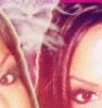
Interesting, you have a lot of friends around the image hahaha.
I agree with Anime.Essence about moving up the mail icon. But all in all, it looks pretty good. |
|
|
|
| *Infinite.* |
Nov 6 2006, 08:49 PM
Post
#9
|
|
Guest |
To be honest, I don't like it at all
 The pictures of all your friends eyes don't really match which is why I probably don't like it, I mean perhaps if they all were taken the same way, and had the same exacty picture quality and such I suppose it would look better and pretty neat. At the moment it just looks like your advertising your friends -shrugs- i suppose the set up and positioning of everything is interesting though. |
|
|
|
|
Nov 7 2006, 03:50 PM
Post
#10
|
|
|
Member Group: Member Posts: 14 Joined: Nov 2006 Member No: 477,678 |
thanks for the crit guys.
as i said, i was just trying things out to make sure i could set up my own div. :P i'm likely to change it soon. |
|
|
|
|
Nov 21 2006, 01:33 PM
Post
#11
|
|
 Senior Member Group: Member Posts: 36 Joined: Jun 2006 Member No: 427,169 |
PRIVATE PROFILE...mmmhh...? that's like the 5th one i try and see...and they are all on PRIVATE... *[GIVE UP!}
|
|
|
|
|
2 User(s) are reading this topic (2 Guests and 0 Anonymous Users)
0 Members: