Designer's Comments
Look carefully for specific instructions
2. Let me know if you decide to use and what you think.
3. Enjoy!
Using This Layout
For specific instructions read designer's comments
- This is a div overlay layout, html knowledge required!
- 1. Log into myspace.com
- 2. Click on Edit Profile (Profile 1.0)
- 3. Copy (ctrl c) and paste (ctrl v) code to the specified fields
Layout Comments
Showing latest 9 of 9 comments

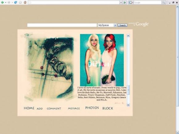
Also, I'd like to say just one more thing if I may. This is called 'Scream' but it looks like this guy is already deceased with blood coming out of his mouth, eyes closed. All in all, I still LOVE this because it's getting me 'involved' in the art. I'm asking questions about this and that's what they say good art is 'supposed' to do: make people question and get involved.
I think I'm a agreeing with what some others here have said. This layout..to me...is beautiful and unique! I love the concept of it....Until I saw Lindsay Lohan over in the corner. I mean, is that 'her' as a blond AND as a redhead?It's 'really' weird to see a melange of these two images -Lahon and this artwork. It must've been an accident or your part or you trying to make a statement? Meh, either way it caught my eye. Good work.

USED.
i really love it.
the simplicity of it is great
alos how it accepts other hTML in it besides the actual layout code
(i tried ot put a music player HTML in other layouts and it didnt accept it, this one did)
thnx :]

PRE-PAID LEGAL SERVICES, INC.
LESTER WILSON JR
MANAGER
P.O. BOX 26915
PHILADELPHIA, PA 19134
BUSINESS 215-288-3508
CELL 215-397-6430
24HR INFORMATION 1-800-934-6419
lesterwilson1982@yahoo.com
www.prepaidlegal.com/go/le sterwilson

sorry about the screen shot, i'll change it! Thanks for commenting =)

Bad ad... LOL

i agree on the screen shot
i was just gonna mention that as well

I agree with schizo. The picture threw me off as well. I also think you should have changed the navigation link font to the same as your header fonts. But I do like the colors. Very tanned and vintage :)

A little plain..
Nice concept though.
And you might want to change the screen shot because the picture in the about me section threw me off. :-/