Help - Search - Members - Calendar
Full Version: Nightclub Scene
Forums > Resource Center > Showcase Booth
xblast196


this took about 2 and a half hours to make, i personally love it... what do you guys think?
Mikeplyts
Um, it's not too shabby, but not great. I kind of like the concept, though.

I don't really like how some areas are realistic (like the DJ in the middle) and others are flat. Also, I don't get what that thing in at the very top in the middle is. I'm guessing it's a light, but I don't think nightclubs have that kind of light. That's also another realistic-flat issue; the light I mentioned is detailed, smooth, and organic while all the other ones look like flat gradients inside a transparent shape. That green is also a tad bit overpowering, and can be kind of an eyesore. I suggest try mixing some other colors to make it not so... monochromatic. Otherwise, it's pretty good. thumbsup.gif
xblast196
this was more of a way for me to just get the concept of the image out of my head and into reality. the far back wall was supposed to be more of a screen rather than a wall itself. granted i could've spent more time on a broader color scheme, but i just couldnt get any of the colors to mix well. i still have the .psd file, so maybe you will see a 2.0 version of this. thank you so much for your comment :)
creole
i basically agree with mike's post. for a color scheme, i personally recommend those neon colors as the spotlights for the pictures instead of just having green.

here are some pics that may help you get going:


manny-the-dino
I second Mike's critique. Also everything looks too soft, imo. Like the lights on the sides, the huge speakers front and center and the crowd as well.
Mikeplyts
QUOTE(manny-the-dino @ Jun 2 2010, 01:02 AM) *
Also everything looks too soft, imo.

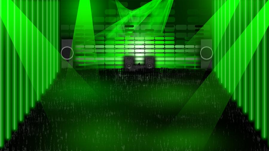
Oh, yeah. This, too, because like the DJ area is pretty rough while the rest is smooth. I would think you would have used a kind of vectored, black silhouette or something for the DJ, to match with the crowd.

As for your color issue, I suggest using soft colors that would go well with that green you're using. Maybe like some nice teals, vibrant-ish yellows/oranges for most of the light areas. As for that "screen", I think some soft reds (and if you can work with it somehow, maybe some light but dull [oxymoron? tongue.gif] purples) would go well on that.

Or, you can try experimenting with gradient maps and/or blending options to mess around with colors and lighting effects.
heyo-captain-jack
OP's obviously never been to a night club
Mikeplyts
QUOTE(ButtsexV2 @ Jun 2 2010, 01:45 AM) *
OP's obviously never been to a night club

Don't matter, it's the thought that counts.


Right?
mipadi
QUOTE(ButtsexV2 @ Jun 2 2010, 01:45 AM) *
OP's obviously never been to a night club

Kafka wrote Amerika without so much as a visit to the United States.
heyo-captain-jack
QUOTE(mipadi @ Jun 3 2010, 01:21 AM) *
Kafka wrote Amerika without so much as a visit to the United States.

I suppose that's a good point, but amerika was at least a decent read, what OP has is just off everywhere
creole
who cares. what matter is if there's any progress and to see what the OP accumulated with the advice we give.
artisticmelodies
I LIKE IT! a lot.
This is a "lo-fi" version of our main content. To view the full version with more information, formatting and images, please click here.