brooklyneast05
May 16 2010, 01:33 PM
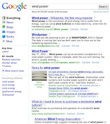
how did you guys feel about google's changes?
also how do you feel about the look of
googles new search with the left hand nav?
Blyat
May 16 2010, 02:07 PM
I didn't notice that the logo changed
but the thing on the left is annoying
karmakiller
May 16 2010, 02:14 PM
The thing on the left annoying, mainly because I don't need it to be there lol
Wikipedia changed, too, and I can't help but look to the left when I need to search for something.
brooklyneast05
May 16 2010, 02:16 PM
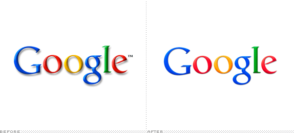
the changes to the logo look way better to me. the heavy drop shadow was making it look dated. but i agree about the search. i think it's annoying.
Joanne
May 16 2010, 02:39 PM
For the logo, I love it! It's a pretty damn simple tweak, but it modernized the whole image.
I agree with everyone above me that the options on the left look ugly and is annoying, but I kind of understand why they added it. There are so many sources of information now, it makes sense to have a very clear way of filtering it all out. If only there was a nicer way of doing it...
sixfive
May 16 2010, 03:04 PM
QUOTE(Christy @ May 16 2010, 02:03 PM)

i hate the thing on the left. it looks weird to me. D:
heyo-captain-jack
May 16 2010, 04:25 PM
I'm looking for a greasemonkey script to change it back right now
creole
May 16 2010, 04:50 PM
taking simplicity a bit too far
datass
May 16 2010, 06:17 PM
QUOTE(karmakiller @ May 17 2010, 03:14 AM)
The thing on the left annoying, mainly because I don't need it to be there lol
Wikipedia changed, too, and I can't help but look to the left when I need to search for something.
i agree. the wikipedia search bar relocation caught me by surprise. i missed it being on the left.
and i think everybody seems to agree that the left bar on google is annoying.
synapse
May 17 2010, 12:22 AM
Did YouTube change also? I personally like not having the drop shadow.
tokyo-rose
May 17 2010, 12:55 AM
I don't care about Google's redesign too much, but I liked the drop shadow behind the logo.
QUOTE(synapse @ May 17 2010, 01:22 AM)
Did YouTube change also? I personally like not having the drop shadow.
Yes, big-time. I prefer the old YouTube layout, mostly because the "related videos" sidebar actually contained videos related to the ones I was viewing.
batman
May 18 2010, 08:31 PM
i didnt like the thing to the left, but i find it helpful when searching google images. i like being able to filter by size.
none345678
May 18 2010, 08:47 PM
I hate the new youtube.
heyo-captain-jack
May 18 2010, 08:49 PM
fainaru
May 19 2010, 10:58 AM
Hmm I didn't know the logo changed too, but it's much more vibrant. It will late a little getting used to now that I have spotted the difference. I like the old logo's drop shadow -- this is coming from someone who is not to fond of them on logos either!
And the new left hand column is shifting gears to what Bing has done for their browser accessibility I guess!
Too many changes happening at once! Deviantart has changed their site up a bit too.
synapse
May 19 2010, 02:29 PM
QUOTE(fainaru @ May 19 2010, 11:58 AM)
Too many changes happening at once! Deviantart has changed their site up a bit too.
I noticed this last night. They've made a lot of little tweaks this year and last.
Dominiloka
Jul 10 2010, 11:17 PM
I must be lost in space because I didn't notice these changes at all. >.< Even the sidebar, FAIL. lol
The design is fine, I guess. Didn't really pay attention to it.
creole
Jul 11 2010, 10:23 AM
idk if ppl already knew this, but there's an option now that's not from google chrome to change the appearance of google's home page search engine. i changed my background to lady gaga :)
Blyat
Jul 11 2010, 10:26 AM
QUOTE(Cum @ Jul 11 2010, 11:23 AM)
idk if ppl already knew this, but there's an option now that's not from google chrome to change the appearance of google's home page search engine. i changed my background to lady gaga :)
are you talking about I-google?
creole
Aug 13 2010, 12:10 PM
QUOTE(Uso @ Jul 11 2010, 07:26 AM)
are you talking about I-google?
lol yeah it's cool how the theme fades in when the page loads
schizo
Aug 13 2010, 01:07 PM
Whoa. Did they just change the way the images page is or did I click a magic button or something?
heyo-captain-jack
Aug 13 2010, 04:29 PM
QUOTE(schizo @ Aug 13 2010, 01:07 PM)
Whoa. Did they just change the way the images page is or did I click a magic button or something?
they changed it a few weeks ago
none345678
Aug 13 2010, 04:31 PM
I don't know if I like it all that much
schizo
Aug 13 2010, 05:37 PM
I was just searching stuff the other day and it wasn't like that. :/ I kinda like that clicking on an image brings you straight to it instead sending you to the website first.
emberfly
Aug 14 2010, 12:49 PM
logo looks so much better.
I use google daily.. never even noticed that thing on the left.
This is a "lo-fi" version of our main content. To view the full version with more information, formatting and images, please
click here.