brooklyneast05
Feb 24 2009, 06:48 PM
so i was watching cnn in this morning and they were reading feedback on tropicana's new orange juice carton. people were bashing it like crazy. then i read more about it online. wtf so much uproar over orange juice.
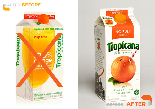
apparently after seeing how upset everyone is, tropicana has announced they are going back to the other packaging and ditching the new look.
i think this had an opposite effect on me, becuase i actually bought a carton of it sunday...
smash
Feb 24 2009, 07:11 PM
it's a silly marketing thing. the new one seems like it would cost less because it doesn't have as much going on on the carton. doesn't matter to me as long as the juice doesn't change.
hi-C
Feb 24 2009, 07:42 PM
I love the redesign. People are just resistant to change, one glaring exception notwithstanding.
brooklyneast05
Feb 24 2009, 07:43 PM
i know...i liked the new design

QUOTE(smash @ Feb 24 2009, 08:11 PM)

it's a silly marketing thing. the new one seems like it would cost less because it doesn't have as much going on on the carton. doesn't matter to me as long as the juice doesn't change.
yeah i think they said that it did cost less becuase it was a more simple design. i'm not entirely sure. either way it doesn't matter to me either.
check the cap out though, it's shaped like an orange!
iDecay
Feb 24 2009, 07:44 PM
I actually like the design, it's a bit more modern. I don't really care though as long as my OJ is still OJ.

It's not like I'm going to keep the carton forever..
hi-C
Feb 24 2009, 07:47 PM
QUOTE(brooklyneast05 @ Feb 24 2009, 07:43 PM)
check the cap out though, it's shaped like an orange!
Oh snap! That's so cute! If anything, they need to keep that.
creole
Feb 24 2009, 07:47 PM
I think the new version looks much more cleaner.
Oh well, the customer is the key to success. Do what they say.
Blyat
Feb 24 2009, 08:11 PM
QUOTE(Beenly @ Feb 24 2009, 07:47 PM)
[size=2]I think the new version looks much more cleaner.
size]
Thats quite funny how people can be worked up over the littlest things
creole
Feb 24 2009, 08:21 PM
oh well the money is the matter
karmakiller
Feb 24 2009, 08:27 PM
I like the lid of the new design! it doesn't look terrible, but I think it's the missing signature straw in the orange that I'd miss.
smash
Feb 24 2009, 08:32 PM
the cap is a nice touch. i do like the straw too. it makes me want one for myself, just to drink orange juice with. i love orange juice.
fainaru
Feb 24 2009, 08:40 PM
Maybe it's the fact that the text is rotated that's bugging me :S
none345678
Feb 24 2009, 08:49 PM
I think they should just move the orange with the straw and the "tropicana" over to the new carton, and get rid of the glass of orange juice then it would look fine.
manny-the-dino
Feb 24 2009, 10:55 PM
I dk what the big deal is. I mean it's just a carton.
But I like the new one. It looks modern & simple. I love the cap. So cute!
Simba
Feb 24 2009, 10:56 PM
doesn't matter, it's too expensive so I ain't gonna cop that
wasn't there controversy over Pepsi's new logo design too, gah dang
Maccabee
Feb 24 2009, 10:57 PM
But tropicana's thing was an orange with a straw through it.
Id be fine with them changing the carton as long as they kept the orange. Even though i love the current carton. To be honest if they did change it i would start getting different ones.
manny-the-dino
Feb 24 2009, 11:36 PM
QUOTE(ArjunaCapulong @ Feb 24 2009, 07:56 PM)
doesn't matter, it's too expensive so I ain't gonna cop that
wasn't there controversy over Pepsi's new logo design too, gah dang

Oh yeah. I like that one better than the older one.
This is a "lo-fi" version of our main content. To view the full version with more information, formatting and images, please
click here.